Over the last year or so I’ve started to notice that health and sports websites tend to have highly-modernized websites that offer a heightened visual experience – usually with energetic imagery, beautiful typography, and scroll-based interactions.
Here’s my top 10 list of web designs surging with energy and vitality.
Montreal Impact “Lets Make History” Website
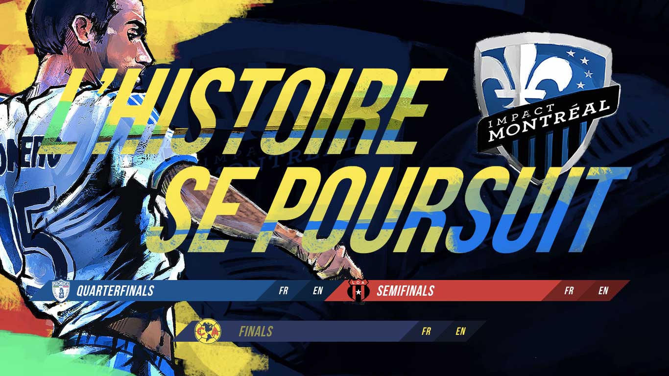
Montreal Impact is a soccer team based in Quebec, Canada. Their website is absolutely bustling with creative energy and exciting hues of raw dominant colours, not to mention the irregular brushstrokes in the highly-attractive background image.
Reebok “Be More Human” Website
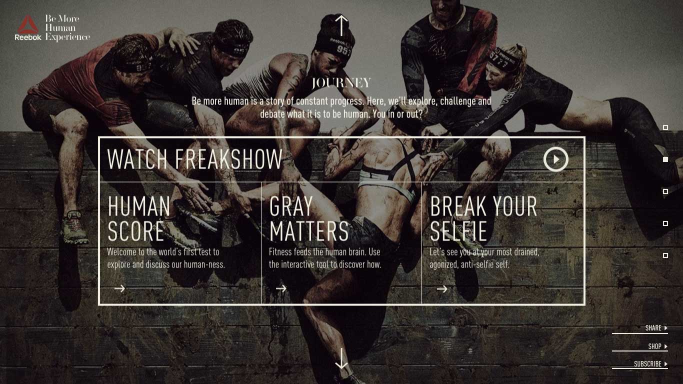
Reebok’s online “Be More Human” campaign is a test of fitness designed to make you feel antagonised, drained, and most importantly: human.
The imagery enhanced by high dynamic range effects only adds to the dramatisation of it all. Hardcore stuff.
Sochi 2014 “Life Fitness” Website
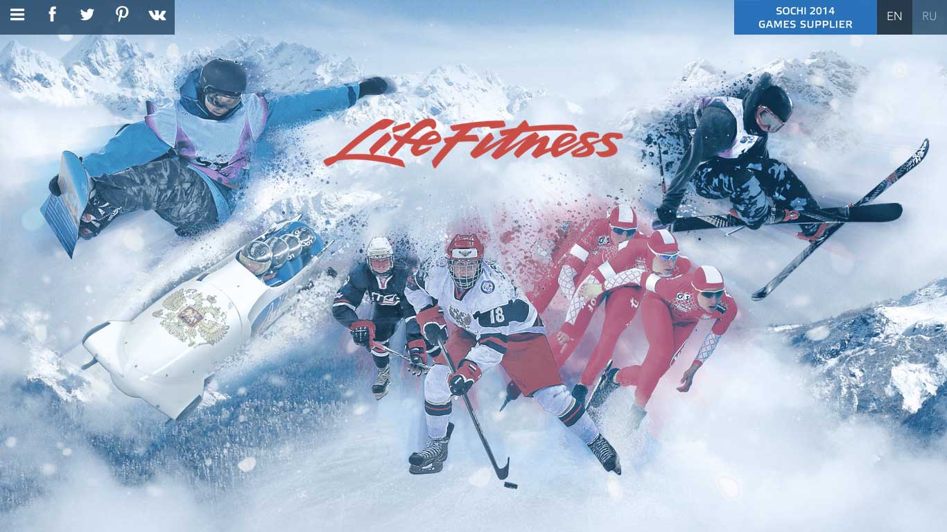
From interactions to typography to colours, this Sochi 2014 “Life Fitness” website may be one of my favourite designs of all time. It’s simply bursting with energetic, high-quality images that tell a story of the history of the Winter Olympic Games.
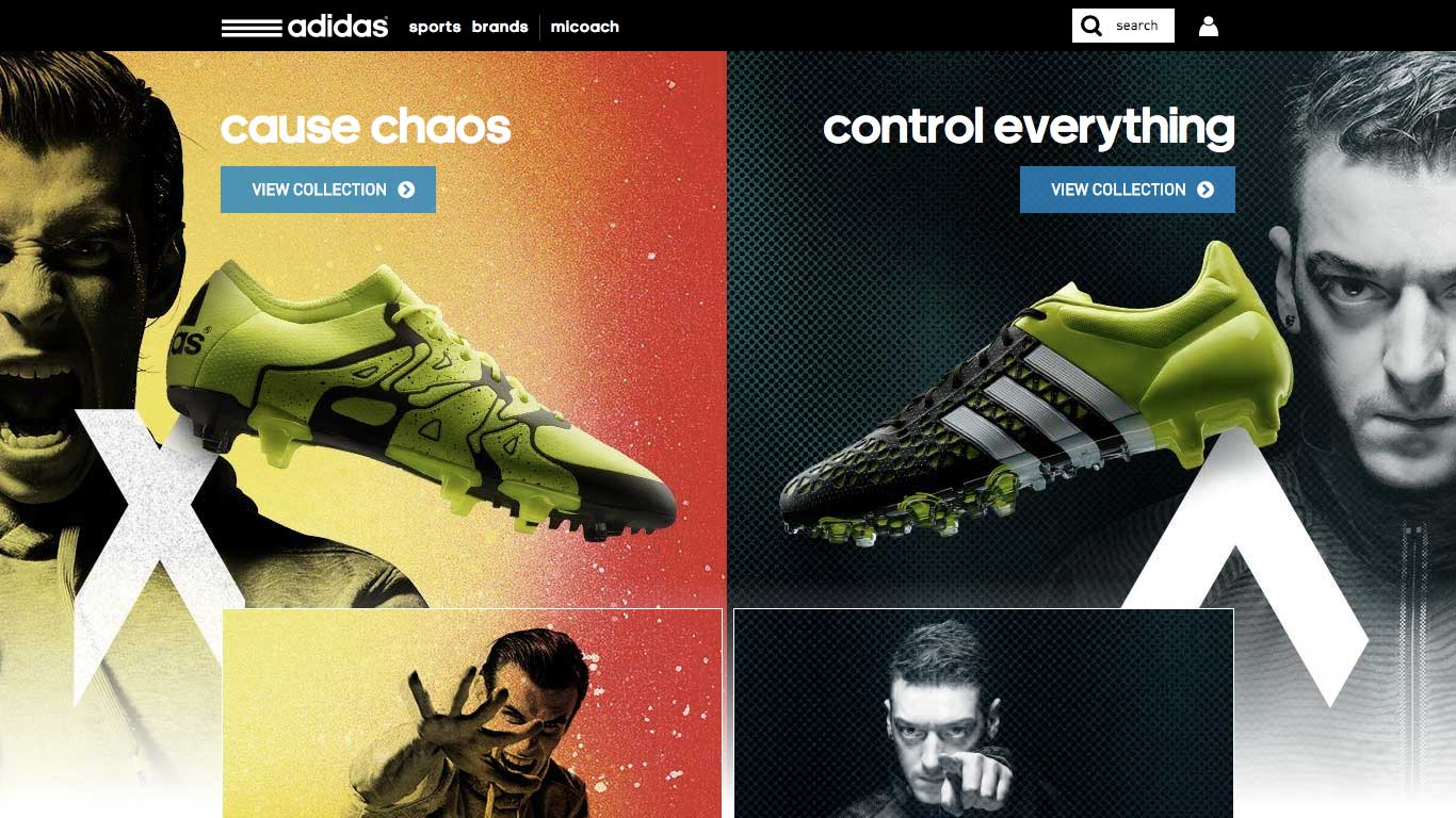
Adidas Official Website
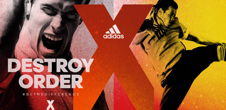
Gareth Bale’s X15 Promo(on the left) is bursting with orange/red fiery intensity in what’s self-described as “causing chaos”. But the design and campaign overall is certainly turning heads.
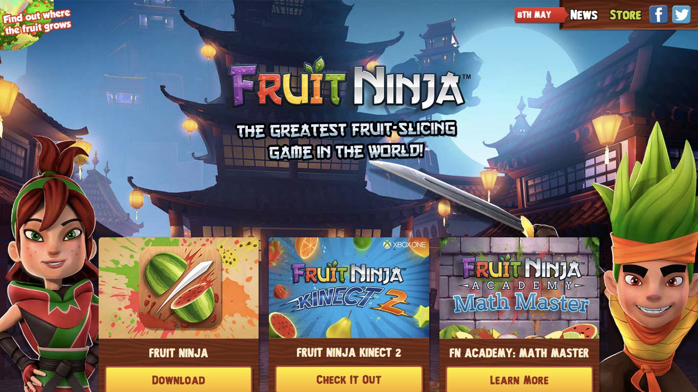
Fruit Ninja Game Website
Eating healthy food and slicing up fruit ninja-style; the ultimate test of stamina and toughness. Combine that with the happy character illustrations, crazy fruit colours and dashing Chinese-style typography and you have yourself an epic website.
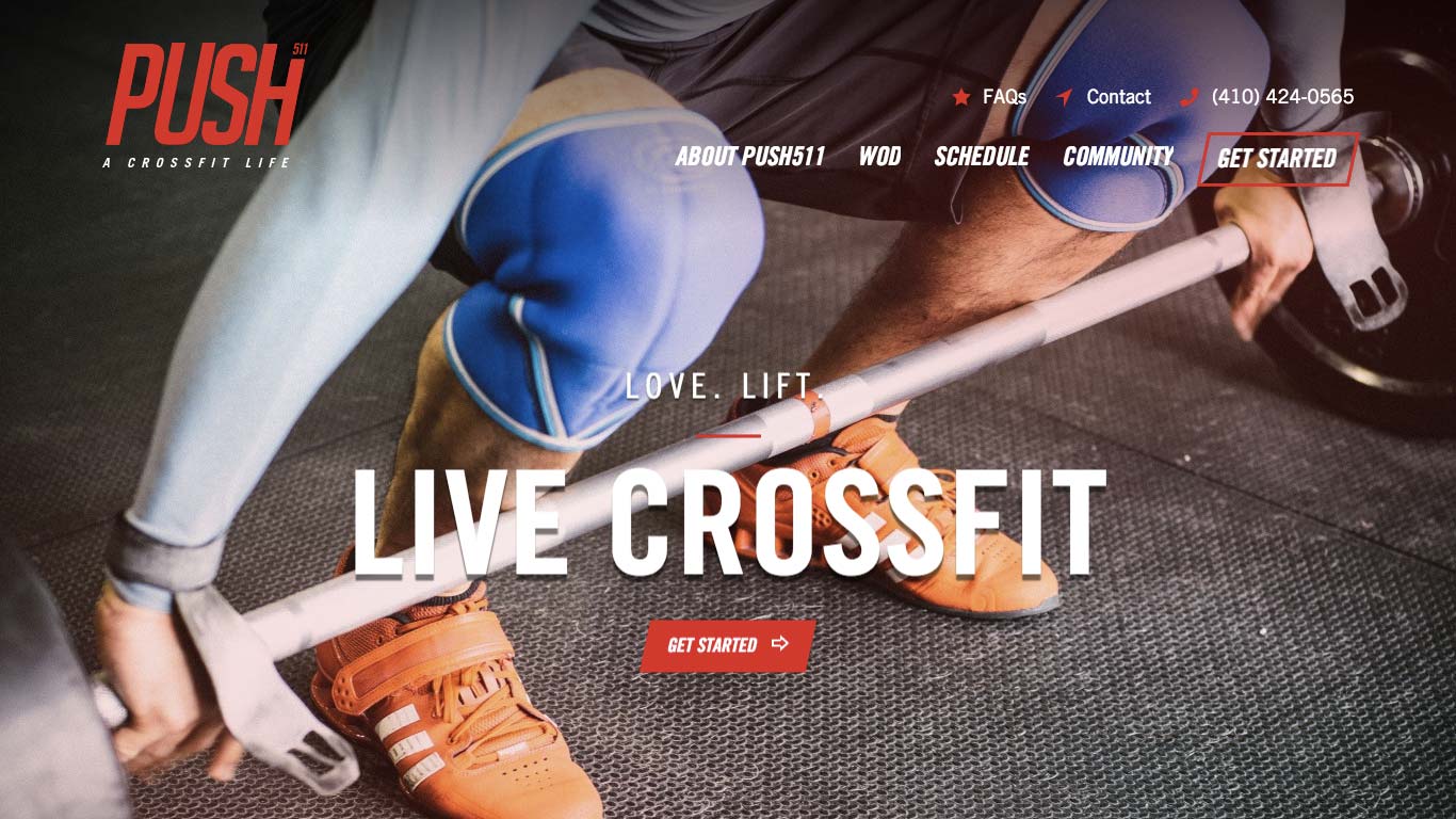
Push 511 Website
Push 511 is a little more on the modest side in terms of creativity, and instead uses emotional design to motivate the audience through the strain and hard work of exercise. This design functions well with the use of encouraging testimonials and bold, actionable verbs.
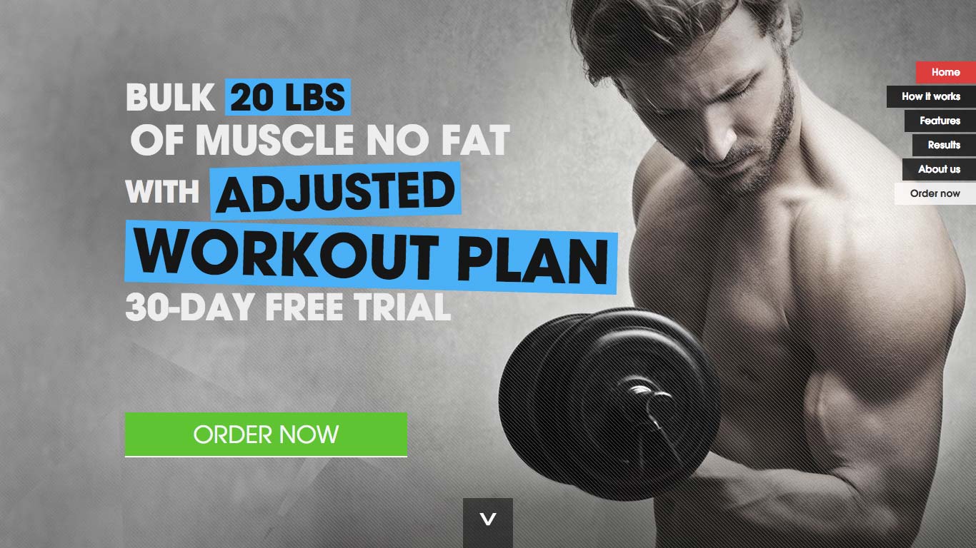
52 Challenges Website
Big, bold, and direct; 52 Challenges does a smashing job of utilising the webpage for only the most important information and furthermore highlighting the keywords combined with an extrusive call-to-action button and a large, descriptive background image.
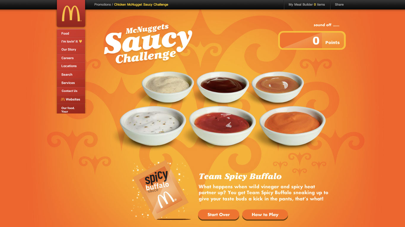
McNuggets Saucy Challenge Website
It’s very much debatable as to whether McDonald’s serves healthy options or not, but their vivid orange background screams vitality. Okay, maybe not screams, but there’s a hint of “we’re trying to be healthy” there. Perhaps McDonald’s is trying to fix it’s bad reputation of selling food that is damaging to your wellbeing. Or maybe they just want you to buy their stuff.
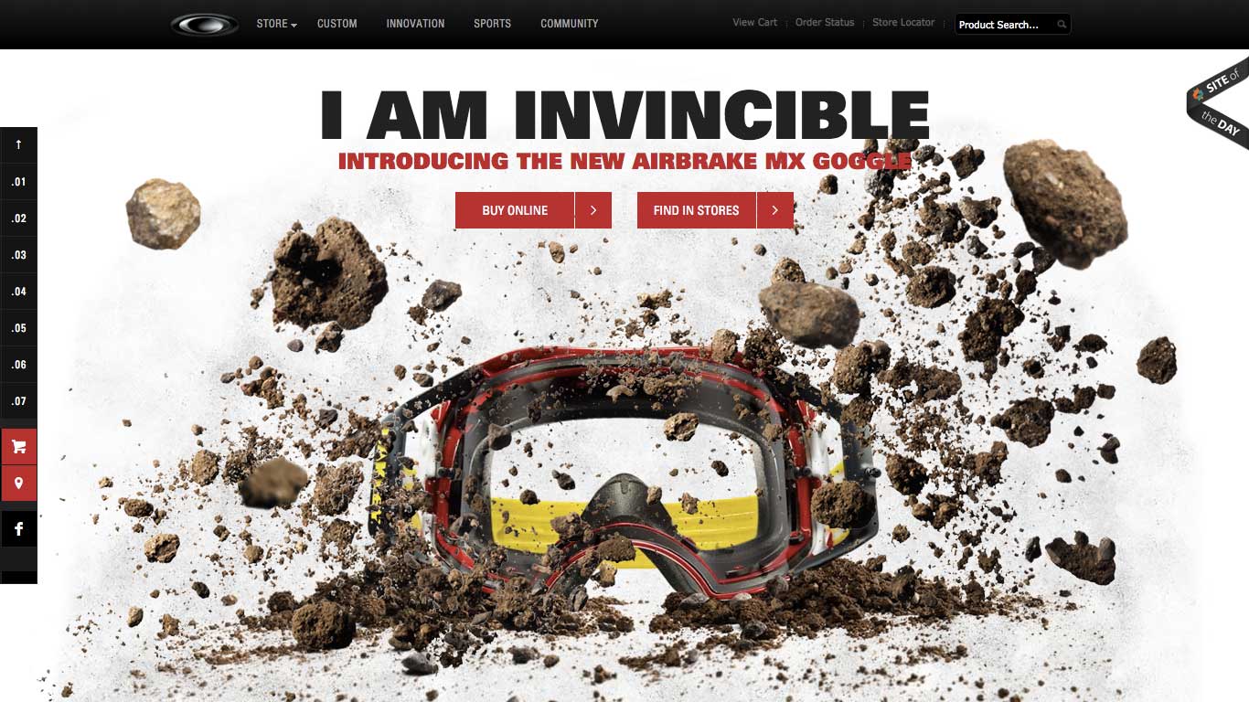
Airbrake MX Goggle Product Website
Airbrake’s main selling bit is the invincibility and sturdiness of its MX Goggle, depicted by hurling rocks as the user scrolls down the page. This demonstrates action and its impact defense.
Parallax scrolling at its best, further complimented by 3D epicness.
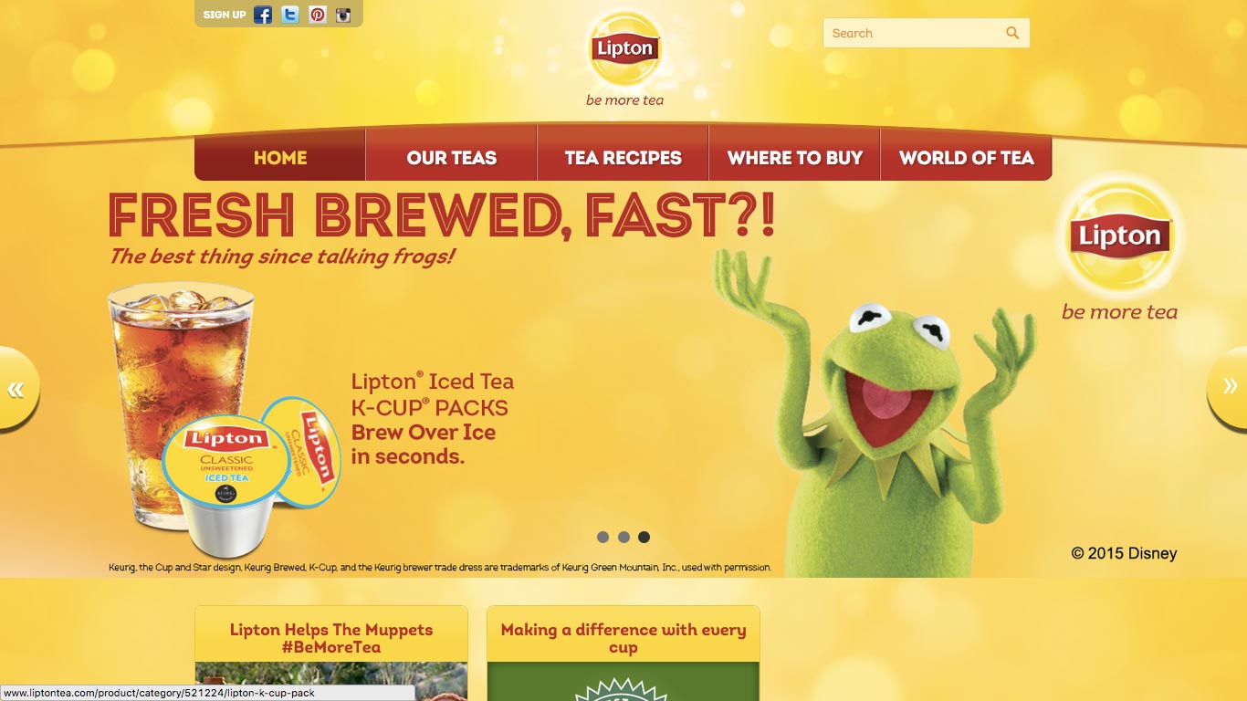
Lipton Tea Website
Lipton Tea, or any natural substance derived from herbage of some sort, is always healthy.
Wellbeing and heartiness can always be implied with a little green whether it’s fruit, vegetables, tea, or an invigorating splash of fresh water.
Lipton’s website checks all those boxes and Kermit the Frog is simply overjoyed with his tea.
The post 10 Bold Websites That Are Surging with Energy appeared first on webdesignledger
