One of the biggest trends of the last few years is using fullscreen hero images combined with big typography.
But like most trends, designers often abuse them only because they’re in fashion, with no regards to critically think about a design choices. Flat design is the worst and often misunderstood.
Minimalism isn’t about stripping down to basics simply for the sake of it. But instead it’s about taking what’s required and utilizing it in such a way that its blatantly easy to understand.
Let’s look at a few examples of clear minimalism with a focus on typography.
Rally Interactive
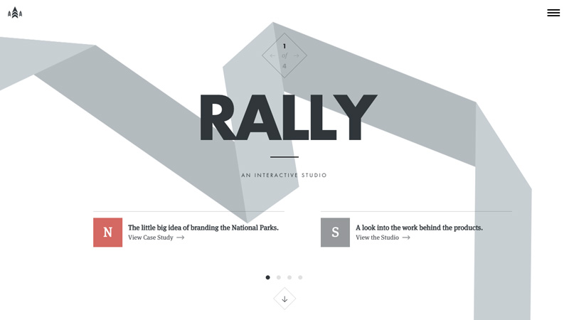
You’ll notice some flat design colours here. For the intention of making something more visible to the human eye, colours stand out very well on an otherwise blank website.
Flat colours accomplish this in a more subtle way without stinging the eyes.
Thomas Buffet
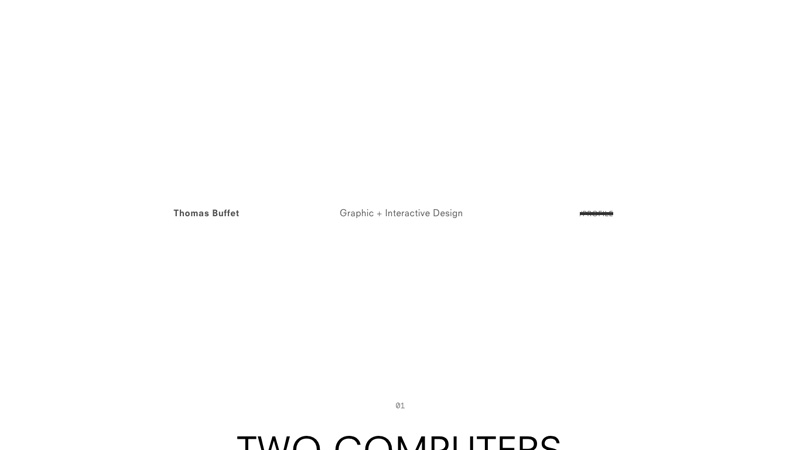
By design, Thomas Buffet includes his most important information smack-bang in the middle of the webpage with nothing more than a sans-serif font and a clean, white background. The rest of the webpage spies on us from the bottom of the screen, but makes itself apparent so that we know where to look next.
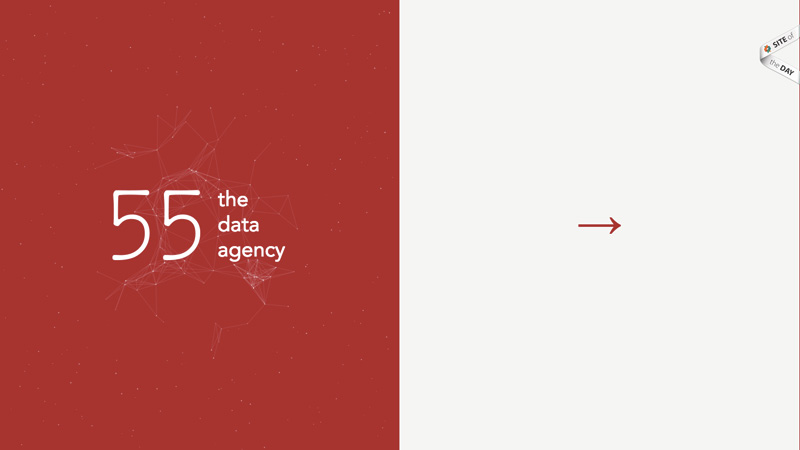
Fifty Five
Fifty Five also rejects a heavy use of imagery in their website, but that’s for a different reason: they’re a data agency.
Since data is communicated with text, this makes for an interesting challenge – one that results in a minimal website with legible typography and a combo of serif and sans-serif fonts.
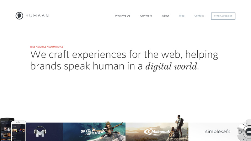
Huuman
Huuman’s minimal design is more than just a style. It’s a demonstration of what they stand for and aim to do for their clients, which is to help them speak human in a digital world.
When a “cool” trend is used inappropriately the website fails to communicate its brand, despite wowing the audience for a split second. Finding a middle ground is crucial to good design.
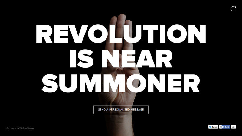
Sendamessage.to
You’ll actually receive a(sometimes rude) message every time you load the page, but more importantly the creator is showing you the concept of the website with a simple header and a clever scroll-based animation. Gestures are very communicative, which makes this minimal-style web design wonderfully effective.
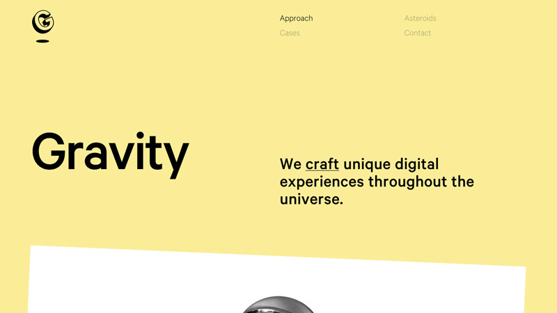
Lunar Gravity
I really adore the use of white space in this design. In fact, this one inspired me so much that a few months ago I built a website for myself inspired by it.
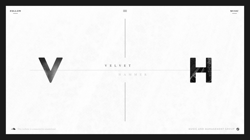
Velvet Hammer
Websites are structurally defined by blocks made to divide content. One thing you may have noticed in minimal design is that their creators fight the need to style those dividers with borders, backgrounds, and anything else they can think of.
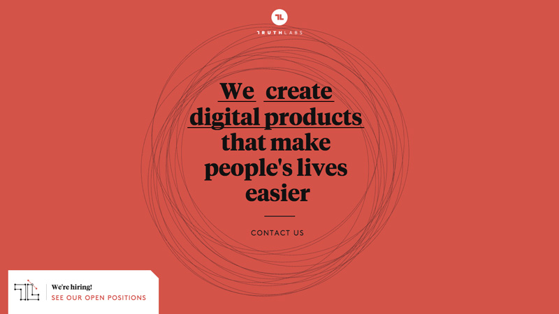
Truth Labs
White is traditionally used in minimal design and it should be noted there is nothing wrong with that.
But by creating a series of snazzy interactions, subtle animations, and a flat alizarin background, Truth Labs creates an enriched experience by doing something other than the norm while still maintaining a minimal approach.
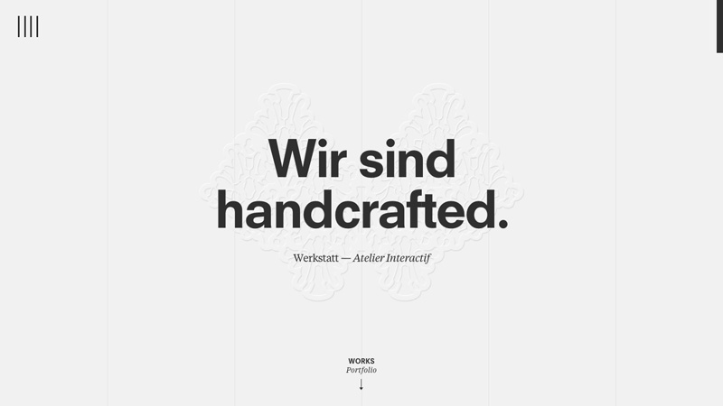
Werkstatt
Werkstatt is another studio that keeps it simple with bold yet modest typography and augments the experience with smooth animations. Yet this studio takes it to another level by even styling the window scrollbar in an effort to keep it strictly monochrome.
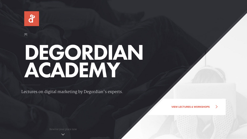
Degordian Academy
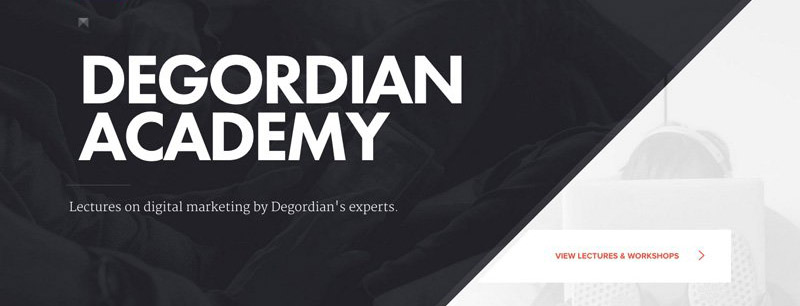
I’ve included Degordian Academy to demonstrate that full-screen header images can work in a minimalist design – as long as they offer contrast so the text canbe read.
When flat colours are not overused we can accomplish a beautiful, well-designed website that makes use of current trends without forcing the user to turn back in irritation.
The post 10 Minimal Websites with Attractive Typography appeared first on webdesignledger
