More and more digital agencies create websites with the focus on touch-screen devices. However, there are still marvelous and top-notch concepts that work at full capacity only on desktops. Today’s article dedicated to such sort of projects. To be more precise, we are going to pay attention to the solution that is unlikely ever to be adapted to mobile and tablet gadgets – custom mouse cursors.
The trick is easily achieved by adding or altering just one line in the main CSS file. Use the basic property – ‘cursor’ – to make necessary changes. Here, you are not limited in choices. Not only can you employ predefined versions such as progress, text or alias but also make use of whatever image you need or like in order to get rid of the boring and habitual arrow pointer. By transforming the classic mouse cursor into an offbeat and unique visual device you are able to add a nice twist to aesthetics, finish off the theme, improve the functionality, enrich user experience and even make the project more friendly to people that have poor eyesight. We have collected 10 exceptional examples of websites that successfully employ custom mouse cursors.
Matt Muirhead
Although at first glance the personal portfolio of Matt Muirhead looks simple and plain with nothing special, everything changes when you start to move the cursor around the screen. The primitive dynamic abstract background turns into an amusing playground that adds playfulness to the website and engages users from the first seconds. The mouse cursor is in the shape of a pencil that makes drawing of straight lines more natural and intuitive.
Sketchy Business
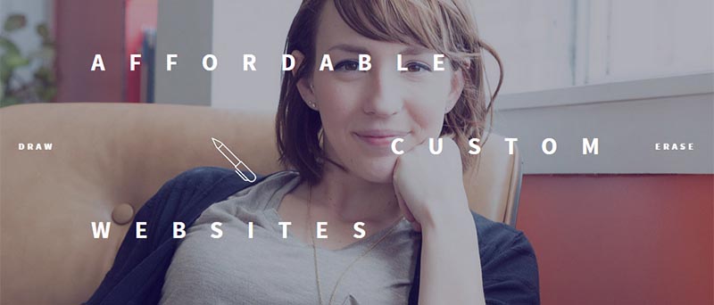
Sketchy Business bolsters the nameplate in an entertaining way that turns out to be a win-win solution. Much like the previous example the mouse cursor has been transformed into a pencil that this time gives you an opportunity to draw whatever you want. Moreover, the team has also provided you with an eraser. You can easily switch between two states and modify your drawing.
MTV Bump
MTV Bump is like a blast from the past. The website looks outstanding with a powerful vibe of the 90s that is realized on the basis of modern techniques and solutions. The composition is rich in various fantastic details. Despite of the lavishness and content-intensiveness you won’t get lost since the team has provided you with an almost giant mouse cursor for accompanying and guiding you through the project. It fits here like a glove.
Flock of Siegel
Flock of Siegel employs a small video for prettifying the background and adding the dynamics. Thanks to a half-tone effect, the foreground content looks bright and intelligible. The team also leverages a custom mouse cursor that is based on a conventional shape of an arrow increased in size tenfold. The solution perfectly fits the theme and serves as a focal point.
MCM
MCM establishes direct eye contact with its splendid animated image backdrop. Unlike the previous example, here the mouse cursor can’t boast of an original shape or huge size, yet it is personified by constant changes in its form in order to give users hints. It does not distract the attention and serves as a supporting element.
Marou Chocolat
Marou Chocolat features a small quiz that offers you to find out the final color of the packaging of their brand new chocolate bar. For users’ convenience and enhancing the theme, the mouse cursor has been transformed into the shape of a color picker. An instrument which is very familiar to those of you who have ever dealt with standard graphic editors such as Photoshop or Illustrator makes the process more intuitive.
Stuff Adventure
Stuff Adventure is a browser game that invites you into a matchless fully illustrated world spiced up with an adventurous mood. The project is designed in the best traditions of classic games, so that it is not surprising that every detail fits the theme even the mouse cursor. The latter has an appropriate design and arrowhead that changes color when it is over a link.
3 Horizons Interactive
3 Horizons Interactive leverages a two-state custom mouse cursor for improving the functionality of the primary slider placed on the homepage. Depending on the current position on the screen, it takes the shape either of a forward or a backward button. Although arrows have a sleek and delicate appearance, thanks to their relatively huge size they get the attention.
Way to Go
Way to Go is an interesting project that gets the most out of modern techniques. It provides the online audience with an exceptional interactive experience. If offers you to take a virtual walk. You should use arrow keys on your keyboard in order to move around. Since the mouse cursor is not needed the team has turned it off to avoid confusion.
Void
Void gets its beauty from a series of first-rate abstract animations that greet visitors on the front page. Here the mouse cursor performs its primary role and in the main has a usual form, as a classic arrow pointer. However, when it is needed it changes shape in order to give users subtle clues. Every form has been taken from a standard list.
Bonus
Headache Off
Headache Off is a website that promotes pills for easing the ache. So that it is unlikely that you will stumble upon something unusual or original here, yet there is a tiny inviting twist. Not only does the vibrant and peculiar color scheme strike the eye and give an edge to design, but also the mouse cursor that has two main shapes seizes the attention.
At first it leverages a classic form. However, when it hits an image, it transforms into a digital rendering of the human hand that makes a clicking gesture. It naturally directs the attention to the required area and enhances user experience.
Conclusion
In general, creative teams opt in favor of custom cursors in order to enrich the project with an extra entertaining constituent. The solution works for various spheres. It gives a cutting edge to aesthetics whether it is a personal portfolio or promo page. Although it does not benefit mobile/tablet UIs, yet it makes desktop users feel more special.
Do you think such tricks can make a difference? Which example does greatly benefit from changing the standard mouse cursor into a custom one? Where does this solution look appropriate and where uncalled-for?
The post 10 Websites That Replace Mouse Cursors for a Better Cause appeared first on onextrapixel

