A lot has been spoken of light user interface elements and they have been showcased widely either as concepts of working products over the years, but what about their dark counterparts? We have some equally good or even better user interface elements in dark colours, but in general we do not opt for them for our projects.
So, in this article we will be showcasing some of the most beautiful examples of dark UI design that we have on the Internet posted either as concepts or working apps.
Dark UI Examples
YouTube Dark
This is a dark UI of YouTube with eye-popping colours and sleek UI elements.
Dark Analytics UI
This is an example of how an analytics app could look in dark UI.
DJ Rig
And that is how cool a DJ rig would look when presented in an elegant dark UI.
Sales Dashboard
How about a clean and modern looking sales dashboard in dark UI?
Fitness App
Did anyone think a fitness app could look this beautiful in dark UI?
Equalizer
This is a perfect example of how simple things such as an equalizer could be spiced up with dark UI elements.
Exchange App
Who knew a simple exchange app could look this fantastic?
Map It
Have you ever seen a dark map? Well, here’s one and it looks amazing.
Music App
This is a very simply and elegantly designed music app in dark UI. A perfect example of how a clean dark UI could give your app the extra edge.
B2B Dashboard
This a modern and clean B2B dashboard designed using dark UI elements.
Notes App
Here is a beautifully designed notes app using dark Material Design.
Calendar
A simple and clean calendar app designed in dark Material Design.
Behance
A beautiful redesign of Behance using dark UI elements.
Travel Cards
Some handy travel information cards displayed in a dark UI.
Newsfeed
A beautiful and eye popping newsfeed in a dark UI design.
Spotify
Spotify’s app redesigned using a dark Material Design, looking awesome.
Register Page
This is a perfect example of a clean and simple registration page designed in dark colours.
Photo Editor App
This is an online photo editor app designed in dark UI to make the main content, i.e., the photos stand out pretty well.
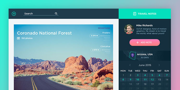
Travel Notes App
Dark UI doesn’t necessarily have to be fully dark. It can be a combination of both light and dark elements too, and that gives stunning results as well.
Mail App
This is a redesign of a mail app in using a combination of dark and light UI elements and it looks fantastic.
Conclusion
Dark UI, when nicely done can outshine even some of the best light UI designs and when combined with a few light elements, the work results in a design that can makes users drop their jaw in awe.
So, if you are thinking of redesigning your app or creating something new, consider having a draft in dark UI and see how it looks, maybe it will be something you will fall in love with and so will your users and clients, and these examples prove that fact.
The post 20 Beautiful Dark UI Concepts for Design Inspiration appeared first on onextrapixel

