Any web designer will tell you that white space is extremely important in order to have a beautiful, clean and user-friendly website design. That is why we selected today 25 light website designs which make perfect use of white space.
Analyze these light website designs, see how white space is used in order to enhance or emphasize some characteristics, messages or graphics in a page and apply these techniques in your future work!
All of these beautiful websites have some unique details you’ll definitely like. Some are monochrome, while others use colors as well, but all of them have very clean, well-arranged layouts.
Here they are!
Repossi
Valdama
Sam Dallyn
Stockholm Design Lab
Your Local Studio
StokkeAustad
Make Directory
NTN
Ben Ashman
Skidmore, Owings & Merrill
Hatch Inc.
iArk
Borheh
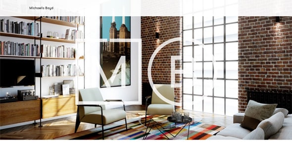
Michaelis Boyd
Norquayco
Tusk
Freytag Anderson
Scanadu
More Air
Innovation Project Canvas
Bhav Mistry
Longton
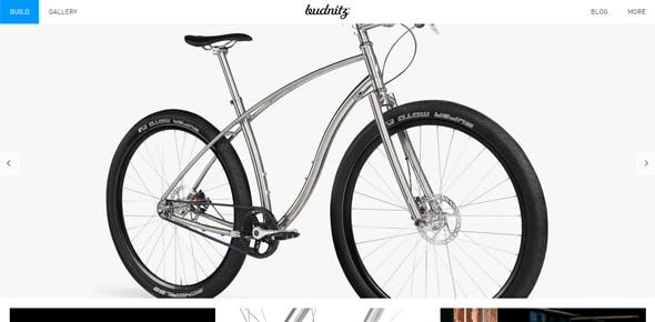
Budnitz Bicycles
Victoria Ling
Ben Trovato
The post 25 Light Website Designs Which Make Perfect Use of White Space appeared first on Line25.


