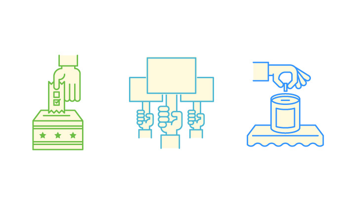
Icon design is a top-tier skill comparable to calculus: there are prerequisites for both that you must learn beforehand. For math these include operators, variables, and deductive reasoning. For icon design you need to learn color, shape, and form to eventually create quality work.
Line icons have bridged the gap to make practicing & learning a tad bit easier. Designers can practice line icons without needing a lot of detail in shading or color. If the proportions look good and the shape is recognizable then it’s a useable icon.
This gallery offers a sample of how you might start practicing to improve your own skills. Learn from these iconsets by following the thin line style and see how you might implement a similar technique in your own workflow.
Maintenance Icons
Healthy Tools
White Lines
Gym Workout Set
Circle Icons
Commerce Icons
Banner Graphics
Enterprise
Blueprints
Dark Mobile GUI
Small Lines
Fastbite
Finances
“Your Move” Icons
Science Iconset
Vector Lines
Elections
Thin Line Icons
Media Icons
Hiring Icons
Colorful Shadows
Chipotle Cultivate Festival
Huffington Post Icons
Section Icons
Presentation Icons
Personal Branding
Sky Bet Offices
Colorful Bright Icons
Network Icons
PS4 Thin Controller
Set of Icons
Music Items
Dark Black Icons
Athletic Sports
Thin Blues
Monoweight
Camping & Outdoors
Construction Building
Clean Monuments
Zodiac Icons
Video Production
Confections
Mobile App Iconset
Outdoor Recreation
Marketing Iconset
Medical Iconset
Construction Iconset
SpiceWorld Icons
Bankin’
Alpinism
The post 50 Modern Examples of Thin Line Icons appeared first on webdesignledger


