Modern techniques allow obtaining amazing results: offer visitors outstanding experience, engage them in an interactive environment, impress with stunning vivid illustrations, and so on. Nevertheless, despite such a lavish diversity and tremendous potential the common constituent of any UI, aka typography, is still a fully-fledged player in this arena that has passion, ardor, and courage in the genes.
Creatives do not get tired of pleasing us with designs spiced up with sophisticated, eccentric and ingenious typography. Static lettering is still a game. In some cases it even plays the first fiddle, creating a tremendous impact. Need some proof? Then examine our collection that covers websites where typography takes the titles to the next level.
Best Examples of Typographic Titles
Dawid Stasiak
Dawid Stasiak has an elegant and sophisticated personal portfolio with a striking Art Deco-inspired typography. The latter naturally singles out the name of the artist and gives a cutting-edge feel to the overall impression.
Culture Experience Days
Culture Experience Days leverages almost the same kind of typography as in the previous example. It is also artistic and geometric; however, here, the double stroke style is skillfully enriched with a three-tone coloring. What’s more, the title is also empowered with some dynamics. As a result, the nameplate is reminiscent of neon signs in the streets.
Studio Duel
Studio Duel’s front page is prettified with a gorgeous and sleek typography. The team has managed to transform a regular serif typeface into a beautiful artwork just with the help of additional lines. The font ideally fits the urban vibe obtained from a cityscape background.
All About NYZ
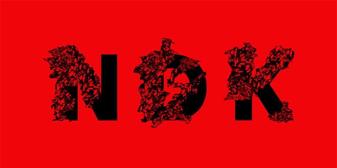
Three letters simply jump at you. They are pretty overwhelming thanks to a bold, massive, authentic look and a powerful intrinsic nature. The graffiti-like typeface enhanced with some lovely grunge feeling and the background fit together like a puzzle, bringing about a profound effect.
NFB/Interactive
NFB/Interactive has a mysterious website with particular focus on typography. The latter is created to exude an image of brutality and harshness. It blends with the environment as well as finishes off the theme.
Silver Agency
Silver Agency leverages a sleek and skinny typeface for the title and navigation aid at the bottom that fits here like a glove. If you take a closer look, you will see that each glyph is defined by a subtle human touch, quirky visual forms and elegant brush strokes.
Leon Marcel
LM has marvelous aesthetics that gives a luxury and chic feel. Beautiful calligraphy used for the headline plays here a vital role. It echoes with the product design and establishes an unobtrusive connection between the website and product. It easily maintains the user’s attention as well as strengthens the general feeling.
LC10K
Here the font is a small yet effective visual device. Not only does it convey the message in a playful tone but it is also a part of the design. Being a harmonious symbiosis of grunge style and script typeface it delivers a bit of a brutal yet striking look.
Nordik
The team puts a tasty twist on the type. They charm with original, ambiguous and unique visual forms. The front page sticks with the minimal solution, omitting all the unnecessary stuff, so that the title is a natural focal point as well as a decorative element that adds spice to the aesthetics.
Zoo Play Date
The home page depicts a charming and fancy typography with a trace of positive emotions. Soft edges of visual forms in tandem with some unusual stylistic alternates and accompanying graphics please the eye and set up a friendly atmosphere.
TryMore
Although it may seem that there is nothing special, just a soft regular typeface with sweet serifs; however, give the website a try. Not only does the team set the headline in motion providing the welcome screen with a lovely dynamic appeal, but it also includes several splendid fonts with retro and techno motifs in inner sections.
AfterDepth
The title has its identity. It looks magnificent and striking. Although the typeface has a quite skinny form; nevertheless, thanks to elegant swashes that spice up several symbols, it easily draws the attention as well as reinforces a highly spirited and slightly impish ambience of the project.
Sankhara
Sankhara features a well-thought-out choice of font. It increases the visual appeal, fosters the harmony and delineates the title. It gets its fantastic look from the geometric essence and a faint aura of space adventures.
Block16
Block16 opts for a decorative thick double stroke typeface. It has a charming chalkboard-related feeling that perfectly collaborates with the yummy scene in the background. It stands out and at the same time complements the composition.
Toyota Barista
Toyota Barista’s front page is defined by a spectacular badge-style logotype that uses a beautiful and frisky script font. The centerpiece is bursting with energy and positive emotions, complying with the idea of the project.
HTPS
HTPS employs a digital techno font with a glitch effect to spice up the welcome section. Although this is quite sufficient to enrich the aesthetics, there are also other creative typefaces. They are used to personify album covers. If you need inspiration give the slider at the bottom a shot.
The Black Friday Totaliser
The Black Friday Totaliser is a great example of how to properly mix and match two non-standard fonts and not screw up. While the elegant contour type gives the design a powerful businesslike sense, the quirky and a slightly comic script font lightens the atmosphere.
Lunati Scenografie
The website benefits from the huge, straight scrapbook-themed typeface. It is enhanced with some interactive details and complementary illustrations. The letterforms are weighty, bulky and complex.
Enso
Enso by Readymag screams minimalism on all fronts. The classic color scheme in collaboration with a ton of white space instills a sense of refinement and delicacy. Colossal lettering ’10’ that is crafted in a smooth and sleek sans serif typeface is the first thing that gets noticed. Though it maintains a simplistic look, it has an artistic nature and certainly catches the eye.
Burro & Alici
Burro & Alici magnetizes visitors with a lovely greeting card that is placed above the content. It invites online visitors to the special event in a charming way. Subtle script typeface serves its purpose well, reinforcing elegant traits.
Signature Art
As a bonus, we want to include this pioneering website. It is a playground where you can leave your signature. The inscription will be professionally brought to life with the help of cutting-edge techniques and converted into a 3D version that you will be able to explore from different angles.
![]()
Conclusion
It seems that typography stays away from the trends. It runs solo. There are letterings made in rough grunge typefaces, subtle elegant fonts, Art Deco or retro-inspired typefaces, calligraphy style typefaces and others that look pretty relevant and appropriate. Original fonts always remain in vogue, thereby opening up a wide range of possibilities.
The post Awesome Typography That Takes Titles to the Next Level appeared first on onextrapixel

