Design trends are developing in an exceptional speed and will continue to grow into the next year, with the increasing demands of the user. Here are a couple trends to keep in minds for a simple and worthwhile user-experience.
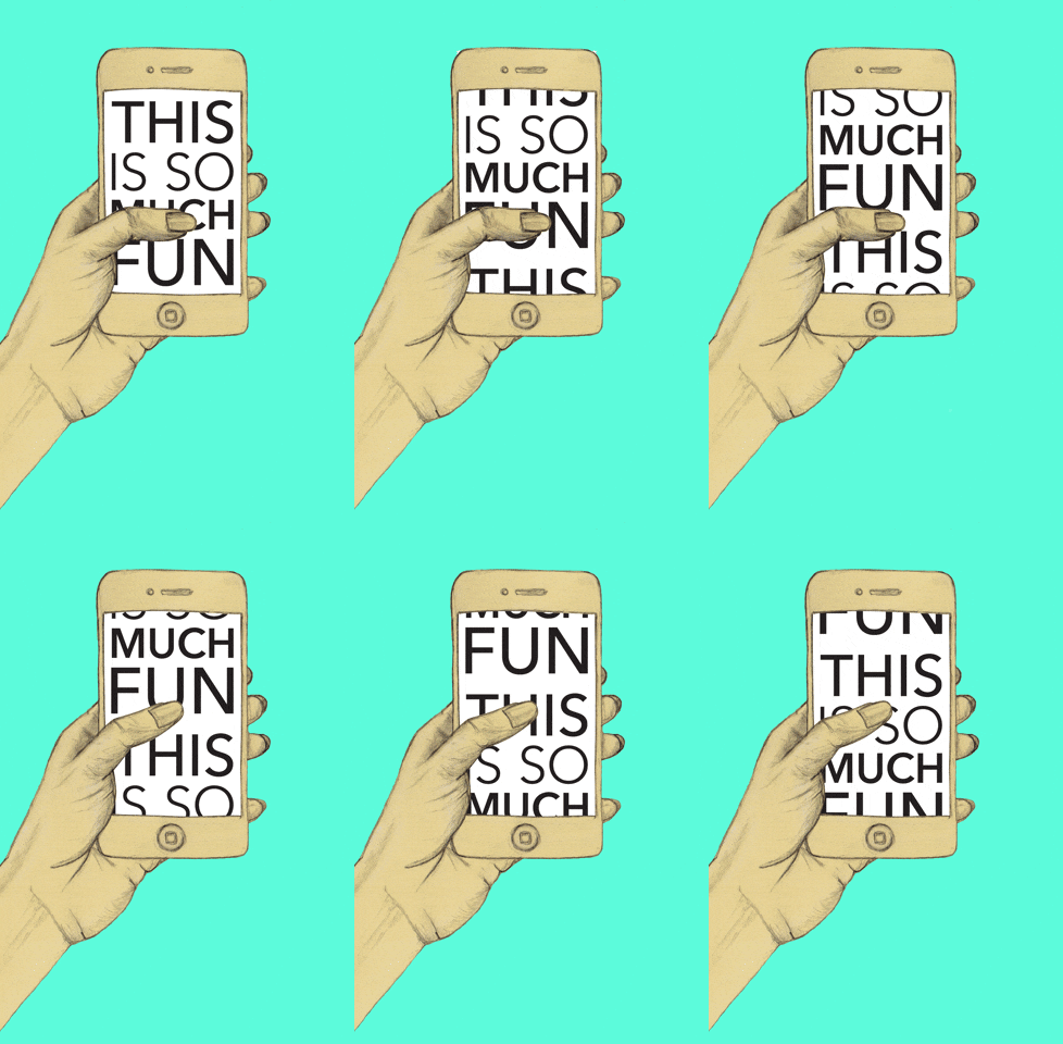
1. Scrolling above clicking:
the user today views all but buys selectively. Since the concept using a scroll bar is obsolete, and people can just use their thumb, we should expect more websites to adopt scrolling first and clicking second.

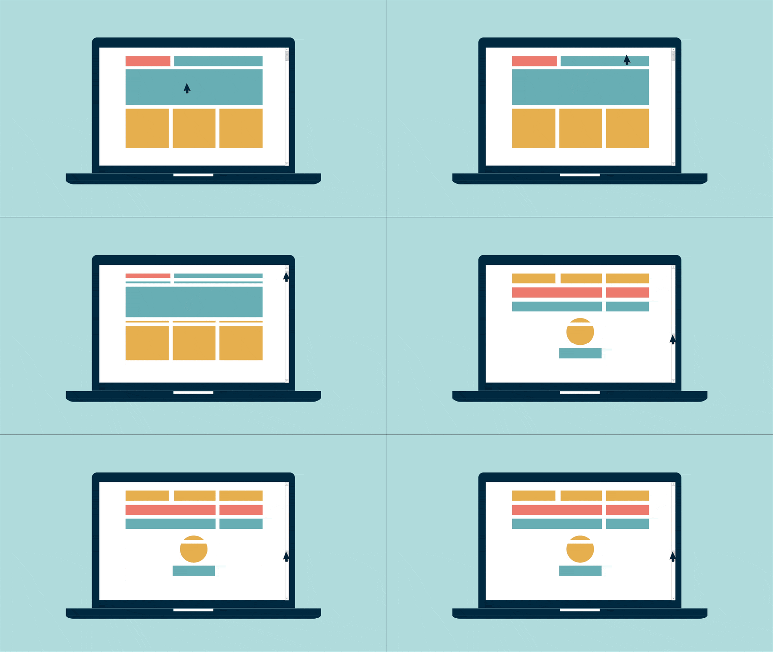
2. The fold is literally dead:
since scrolling has become way easier, web designers now have the opportunity to do what magazines have been doing for ages, full-screen image image titles with no text/links visible until one scrolls down.

3. Animation is back again:
with the internet speed improving considerably, GIF’s and flash animations has become really popular. Since a flat design can look pretty monotonous, animation can help a website to stand out from the rest, and also pack more information into little space.

4. CSS shapes:
CSS shapes allow a designer to flow his/her layout into shapes like a circle. The outcome looks really cool, but as of yet, it is not supported by all browsers.

The post Design Trends To Look For In 2016 (In The Form of Gifs!) appeared first on webdesignledger

