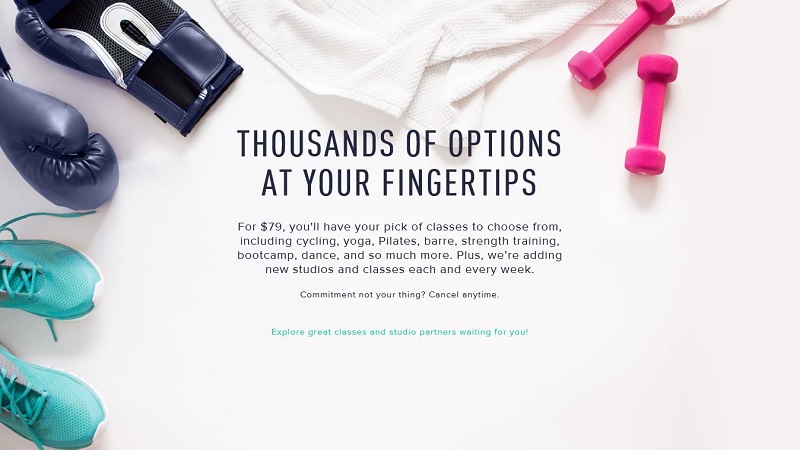
There is no need to explain to an entrepreneur why he needs a landing page with a cool design. It helps achieve various goals – from attracting more customers, increasing conversions to getting new subscribers or active users.
You can achieve your goals in different ways. Elements you use on your landing page will vary depending on these goals. The length of a landing page itself or the length of its form, the number of CTA buttons or the amount of text, color palette – all these factors can improve your landing page design if used wisely. Let’s check out some useful tips for creating an outstanding landing page design.
How To Design a Great Landing Page
Color Palette
When talking about the color palette of a landing page, I mostly pay attention to color contrast between the main colors of the page (its background colors) and the tone of the CTA elements, such as buttons and headlines. Color contrast helps increase the call-to-action effect and makes it stand out among all other design elements.
Choose colors for buttons that won’t be used for any other element on a page. In such a manner, you will highlight the button for the users. That doesn’t mean you should choose only vibrant tones for your CTAs without paying attention to the harmony. Just pick up the colors that contrast with the background but add to the color palette of the entire landing page.
Don’t forget about the color psychology when selecting a color scheme for the landing page. Color choice may increase your traffic and bring you more conversions as well as kill your business. So keep in mind color meanings to trigger the right emotions and push the users to learn more or perform the action you need.
Bold Headlines
One landing page peculiarity is that you have just a few seconds to attract a user’s attention and persuade him or her to perform an action you need. The page can feature a cool text that lists all your advantages and describes the benefits a user gets from you. But if you can’t make people wish to read more about it, you lose your clients.
Bold headlines and clear call-to-action texts should make this work for you. Headlines are the first thing a visitor sees on your page and it should be clear, speak right to the users and motivate them to learn more info about you and your services/products.
If you have a long landing page with lots of content, you should have a few headlines that divide the text into several parts that are easy to perceive and digest. Each headline should point out a specific topic that users may read in the following passage. It’s like a bullet points list that helps share the main info in a few words, stimulating users to read more.
Calls-To-Action
As I already mentioned above, call-to-action elements must stand out among others and really push users to perform the action you need. It’s the secret of high conversions and ROI, so you should put a lot of effort here. People should know what to do after reading your headlines and other content, and CTAs should guide them through that process.
Use words that draw users’ attention and make them want to perform the actions you’re asking them to do. Such emotional triggers like “free,” “now,” “instantly,” “new,” “here” in combination with personal pronouns that speak directly to users (“you,” “your” etc.) improve plain text and increase clicks.
Conversion buttons should be placed right next to the relevant calling-to-action text or/and the button itself should contain such text. Buttons should be big and bright, any text on them should be easy-to read and contain a verb that “calls” to a visitor.
How many CTA buttons should a landing page have? It’s hard to tell the exact number. It depends on various factors. On the landing page length in most cases. The longer the page is – the more buttons you may need. But don’t overuse them: three (four for extremely long pages) is enough in most cases. Avoid using different CTA buttons on one page – it distracts users and may prevent them from performing an action you need.
Another question is the placement of buttons. Try to follow the natural reading path of a user throughout the page. Experiment with taking advantage of so-called “reading patterns” to find the best and the most effective CTA arrangement for you.
Keeping it Above the Fold
There is still no complete answer to the “above the fold” issue. Commonly it was considered that placing CTAs below the fold ruins the entire idea of a landing page and brings no conversions.
This myth was demolished a long time ago by many researches and tests that in some cases proved over 300% increase of conversions after the CTA was placed below the fold. There were tests that showed no significant difference between copies with CTAs arranged above and below the fold. Moreover, in the mobile era people are used to scrolling so there’s pretty much no such thing as “below the fold” here.
In general, it doesn’t matter if your button is seen in the first 800 vertical pixels of a page. It matters what quality of content it follows. The more clear and beneficial your copy is to a user, the more value it sets – the earlier a CTA can be placed.
Responsiveness
Heavy use of mobile devices demands all pages to look and perform great on various screen sizes. Responsive websites are a must-have for website owners and landing pages are no exception at all. There are some factors you should consider when customizing your landing page design for mobile devices.
First, give your users scroll cues to trigger their interest and force them to explore your page more. As I already said, people are used to scrolling if they are interested in what they see, especially on mobile devices. So they should know that there is more content below and be intrigued to learn what you offer.
Flat-Style Landing Page Design
Don’t neglect the way touchscreens are used when resizing fonts, images and other page elements for smaller devices. There are no mouse cursors on touchscreens and people use their fingers to perform all manipulations. You have to leave enough space around buttons and clickable elements to avoid users’ frustration.
Form Length
Sign-up form length is a vague question and it requires much of your attention. Shorter forms perform better as people don’t really like filling out many fields. But it depends not only on designing for users but on your goals too.
Shorter forms will work well if you need to collect many leads regardless of their quality. Otherwise, if you need high-quality leads and their number is not a focus point, try using longer forms to collect specific info and attract only valuable users.
Minimalist Landing Page Design
![]()
What to ask your visitors is another tricky question that depends on the level of trust in your brand, goals of your campaign, and what impact you wish to make. In many cases, email and name fields will be enough. For more specific purposes (to get more info for your B2B campaigns) you may ask for a job title, phone number and/or location.
Creating Trust
Trust is that factor that impacts landing page conversions greatly. After gaining people’s attention, show your potential clients you are a trustworthy brand. It increases transactions and persuades users to fill in your forms and give you the info you need.
Include loyal clients’ testimonials or various guarantee seals. Add press and other sites’ mentions of your brand. Researchers say that trust-building factors increase conversions and engage more customers.
Test! Test! Test Again!
Frequent testing is the key to success. Try various designs, test CTA placement and their colors to find out what makes a greater impact on your customers. Try different form lengths and form fields to understand what may frustrate or scare your potential customers away.
It doesn’t mean you can rest after the first testing is done. There’s always room for improvement. What worked for years may not work some day later. Changes are always for good if done wisely. So try different ways of improving your landing page and getting more customers.
Conclusion
Hopefully you have gained some smart tips and good ideas from these guidelines, and can tweak your landing page design accordingly. Or maybe you were already aware of most of these pointers and your landing page is converting at an amazing rate.

