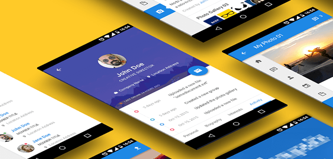
The floating action button is a lightweight, elegant, dynamic, fast and efficient assistant that aims to support the primary navigation and enhance user experience. Being just a small circular element that moves along with the user, independently soars above everything and as a rule, adheres to the right side, it is able to extend the functionality of each screen as well as make a program handier.
As the Google specifications imply, the button should bear a constructive tone and provide quick access only for important instruments. The guideline encourages you to equip it with fancy transitions and smooth eye-pleasing shifts between various states, opt for intuitive and clear graphics and vibrant and striking design, as well as avoiding using it for minor or destructive functions. We have compiled a small collection of fresh mobile user interface concepts that have mastered this new trend.
Floating Action Buttons
Instagram Material Redesign
Instagram Material Redesign (Part 1) by Chris features a small circular button with a subtle shadow that is painted in a corresponding dark blue coloring. It allows taking quick photos as well as provides owners with extra functionality. It accompanies the majority of screens.
Android & Wear App Ecosystem
Stephan Castro leverages a round floating button that thanks to the red tone stands in sharp contrast to the content. It opens five tiny icons with supporting titles crafted in a bright coloring. They are arranged from bottom to top.
Magnet.me
Jules Holleboom goes for the same approach as in the previous example. At first, it is just a regular circular button that sticks to the bottom of the page. When the user hits it, it smoothly reveals three other icons that are placed vertically one after another.
Coloring UI
Lois Yang does an excellent job of choosing the color palette since the UI is pretty content-heavy. The bright solid red backdrop in tandem with a subtle shadow sets the icons apart from the content flow, unobtrusively drawing attention.
Drooling by Henrique Ferreira
Here the floating button is bolstered by the elegant semi-transparent overlay screen. The latter is needed to provide the icons and titles with a robust foundation since the application is populated with a great deal of yummy images. A tiny deviation in the trajectory adds a zest to the design.
Floating Action Button – Add Media by Eric Azares
The o-shaped action button sits at the bottom of the page and includes four CTAs that are arranged in a circle. In such a way they are quickly accessible. Each icon has a relatively enormous size, bright color, and a sharp intelligible glyph.
Daily UI 010 by Ben Transue
Here the floating button is linked to a big sidebar panel that emerges from the right side and slightly shifts the content to the left. Being associated with social media, it includes all the popular portals: Pinterest, Twitter, Facebook, Google, and others.
Attachment by Alex Riabushko
The button and its CTAs are designed in nifty flat style and one color. However, the hover status changes the default blue into vibrant orange. Huge glyphs inside the circles are intuitive and legible. The element offers users visual cues to quickly achieve their goals.
Material design app PSD template by Daniele De Santis
The UI is created in the best traditions of modern Google specifications. The classic floating button calls a big panel that takes up almost the whole screen and covers the actions required for working in the ‘Inbox’ section. What’s more, this is a freebie, download and put it into action.
Mobile UI by Smiley
The artist showcases numerous functional screens of the concept. As you can see, almost each page has its action button. The latter evokes a small yet full-height panel that sits on the left and occupies about fifteen percent of space.
Floating Action Button
Floating Action Button by Tyler Berry breaks away from the most part of those listed in our collection. Not only does it ditch juicy coloring and lovely shadows but it shows the icons in a line on the top of the UI.
Floating Action Button by Giulio “bart172″ Smedile
While the majority of buttons are related to other buttons, this one is connected to the sterling keyboard. The author gets the most out of this tiny floating assistant. He also offers a seamless transition effect between two states.
UX Exploration – Gooey FAB by Paul van Oijen
The floating button demonstrates a set of CTAs in a row. It occupies the lower part of the screen and is placed from side to side. Two-tone coloring, solid monochrome canvases, pixel-perfect glyphs and shadows create the aesthetics.
UI for the thumb by Jochem van der Veer
The concept uses a floating action button that looks similar to the majority. It adheres to the right side, has a plain and straightforward look and catches the eye. In some cases, it goes hand in hand with a miniature version of the logo.
Floating Magic Button
Floating Magic Button by Lee Giles is highly minimalist regarding functionality. It is used only for giving users quick access to the workspace where they can create their book. The design complies with Material standards and meets the mood of the app.
theScore Android by Matt Legaspi
Here the button with the CTAs looks elegant, sophisticated and refined. Line style paired with beautiful two-tone coloring, where blue steals the show, achieves outstanding aesthetics as well as transforms actions into focal points.
FAB for User Engagement by Parallel Labs
The artist employs an action button, the design of which gently echoes with the top navbar. It aims to engage users and make them feel comfortable within the project. It is linked to a pop-up window that appears from the bottom right corner and seizes the whole screen.
Alternacare by mayur karodia
The author hides under the floating action button filters that let users sort out the redundant information and reach the goal within seconds. Thanks to a bold look and bright color it does not blend with the content and strikes the eye right away.
Swipii App Concept
Swipii App Concept by Sarah Ahmad is based on several fresh solutions. The floating button is one of them. It serves its purpose well, making the user’s life easier. It is placed at the corner of each page and shows a pop-up page with QR code to scan and collect the points as fast as ever.
Liquid Floating Action Button by Shu Makino
This is a short animated gif that demonstrates the standard workflow of the floating action button. It is powered by smooth transitions. It includes seven items with an elegant form that appear one by one and adhere to the right side.
Conclusion
Floating action buttons can easily turn into a must-have, since it they an elegant and pretty simple way to improve both UI and UX. Supplying users with quick access to vital functions, they get straight to the point and make utilization of the app fast, effective and productive.
The post The Floating Action Button – An Upcoming Popular Design Trend appeared first on onextrapixel

