To build a conveniently interactive application or website, you’ll have to create a noticeably usable UI.
The UI of a product (app or site) is crucial. It’s powerful enough to create a positive or negative perception from the very first appearance.
A smooth and consistent UI allows visitors to seamlessly navigate through your site; whereas an inconsistent interface will make a chaotic layout that will surely annoy visitors and ultimately force them to abandon the product.
A surefire UI design is the best approach to guide visitors to efficiently access the design, and easily seek the information they need.
An interactive, intuitive, and impressive interface may be construed as good UI design. By endeavoring for a visually consistent interface you’ll garner much success among visitors.
What Does Visual Consistency Mean?
By making consistent use of visual design elements including color, typography, and layout, you can ensure a smooth flow of actions. This will eventually help visitors to navigate through the design with flair and conveniently accomplish their task.
So it can be said that consistency is one major key to a successful design.
Along with consistent use of elements, it’s also essential to consistently position visual elements. If an icon (let’s say search bar) is at the top right corner of a page, it must remain in that same position for the entire layout.
How To Make Visually Consistent UIs
There are several factors upon which one can focus to deliver a consistent interface design.
I’ll break down each point in the following sections along with some brief examples.
1. Distinct and Consistent Typography

Typography is a crucial visual element which always makes a first impression. It’s required to be handled with utmost precision.
You might wonder how one would create a distinct and consistent typographic experience. Well to create consistency in typography one needs to focus upon the typefaces, text styles, sizes, and colors.
The heading, and most importantly the body, must remain true to themselves. Paragraphs should look different than headings, but similar to other paragraphs.
Using too many unfamiliar font can lead to poorly-styled text, which brings illegibility into account.
It’s advisable to write clear messages that can help users to easily access your product. Stick to a few fonts and keep them readable.
2. Keep it Simple!

It can’t be denied that a bulkier interface will unnecessarily add to the design complexity.
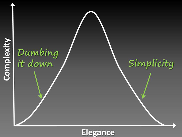
Keeping things simple by using consistent UI elements can dramatically improve the usability of a product. One must keep the user expectations in mind while designing the interface. Both internal and external experiences of users should be considered.
This will help you deliver a design that your viewers are already familiar with. It must be ensured that while creating a sense of familiarity, make sure that your interface design appears fresh and appealing to viewers.
You can also control the flow of the interface and make it appear more apparent by offering only a few numbers of choices.
This can be accomplished by making your content expandable and collapsible. It’ll allow users to explore the content only as needed.
3. Offer a Visual Treatment
The visual treatment may vary from one product to another. But it’s vital to ensure all visitors get the same visual treatment throughout the product.
You can choose a visual language of your choice and embrace it wholeheartedly. This will create a professional impression and give visitors a sense of security.
For the ultimate consistent visual treatment you must ensure consistency among all UI elements. This means all related components must display in a similar way.
For instance, if you’re showcasing your services, all the services should be represented in the same fashion (size, color, language, layout, etc). If one is enclosed in a circle, other services should look very similar as if they’re all part of a group.
Let’s consider an example: The homepage of Appsted represents various development services that it offers. It can be noticed that all the services are displayed in a consistent manner.
Final Thoughts
Embracing visual consistency in interface design can definitely heighten the overall look and feel of your work. In fact, it can also curtail your maintenance and development costs.
With consistent design techniques you’ll generate a marvelous user experience, which causes more visitors to interact with the design for longer periods of time. Take the aforementioned tips into account; these key tips will help you deliver stunning and highly usable UIs over and over again.
Author: Addison Cohen is a mobile app developer working with Appsted Ltd, the leading mobile application development company which delivers comprehensive mobile app solutions. He loves sharing the latest information about mobile technologies like iOS, Android, and development processes.
The post Creating a Visually Consistent UI Design – Key Tips & How To use Them appeared first on webdesignledger


