It seems that the minimalist approach cannot be applied to navigation patterns, since this integral part should always be all-embracing and universal. However, as practice shows, it is possible to hide it from prying eyes under the hamburger button, get rid of the scrollbar or any standard type of pagination, and leave users with nothing more than just tiny visual cues that show the direction.
Surprisingly, users will not get lost. They are much smarter than you think. For decades, we have been used to scrolling down to explore the project, more rarely to move horizontally or up. So that today we do not need extra signs or navigation aids, we intuitively know what to do. Developers of parallax-powered websites leverage this notion to make their websites more native and handy for touchscreen devices. They unify interfaces by ditching elements that would be useless in tablets and cell phones such as scroll bars or tiny controls and rely on our insight. Today we have rounded up 20 examples of long page websites that require more touching than clicking.
We Are Top Secret
We are top secret goes for modest ways in terms of navigation. There is no obvious vertical scrolling or eye-catching arrow button that points down that as a rule sits on the bottom. There is just tiny lettering ‘scroll down’ that blends into the environment.
Fixed Group
Fixed Group has a fantastic website with the main navigation hidden under a hamburger button in the top left corner. There is an ultra-narrow arrow that gently invites readers to scroll down. The decorative effect of slight overlapping also forces users to move fingers up and down.
Giampiero Bodino
The website offers an excellent experience for touchscreen devices. The whole project is intended to be explored through th drag and drop technique or with your fingers. You can move both vertically and horizontally.
Lois Jeans
Lois Jeans boasts of a refreshing and vibrant design, the beauty of which lies in a skillfully executed chaotic appearance. There is a sticky top navigation bar that follows users while they are moving down. There is no traditional vertical slider, so that you need to use your fingers or the space bar for traveling around the project.
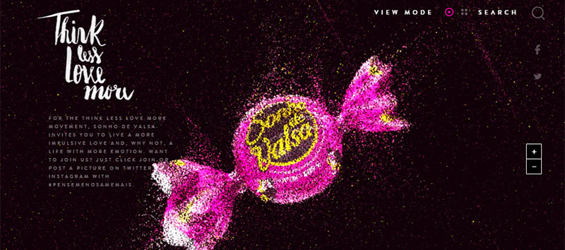
Think Less Love More
Think Less Love More is a cutting-edge project with mind-blowing interactivity. You do not have to traditionally move vertically or horizontally; you just need to go deep inside. There are two tiny buttons ‘zoom in’ and ‘zoom out’ for exploration. The mouse wheel or fingers will be the best choice for exploring.
Weltrade
Weltrade has a matchless landing page with a gorgeous, brutal atmosphere that is much more convenient to experience through touch screen devices. Relatively huge rhombus style buttons are ideal for the fingertips.
The Boat
The Boat offers a great visual storytelling experience that is filled with splendid illustrations. Like the majority of such types of projects, everything is driven by the scrolling effect. So that all you have to do is just move down. Notice, there are no indicators for the next chapters.
Well Storied
Well Storied employs round shapes to enhance navigation. It is much easier to hit such types of controls. There is no additional aid, only pins and graphics that help to lead you through the project.
Urban Walks
Although Urban Walks implies the standard navigation that is presented via a set of line style circles on the right side, it is more optional. Use your fingers to comfortably move around and find out more.
House of Borel
House of Borel gets rid of everything excessive and unnecessary, even including navigation. The landing page features the title, several CTAs, and a tiny animation. The latter indicates that to delve deep into the project you need to use your mouse or a finger.
Melanie F Lookbook
Melanie F Lookbook owes its matchless and refreshing appearance to gorgeous coloring, complementary graphics that are scattered throughout the page and an unbalanced layout. There is a primary menu, but there is no regular scroll bar on the right side, just a microscopic word ‘scroll’ and a thin line that points out the direction.
La Region des Musees
The website strongly relies on the visual impact produced by photos. There is a tiny menu button on the top and a small yet eye-catching outline diamond that shows the way.
Giacomorelli
Giacomorelli offers a quite interesting and memorable user experience. You can feel the whole power hidden in it with the help of your tablet or cell phone.
Born
Born breaks away from conventional long-page websites and removes vertical scrolling. Thanks to excellent contrast every foreground item strikes the eye. So that the small circular button with an arrow on the bottom specifies the direction without difficulty.
Nothing but Thieves
Nothing but Thieves has a dark yet captivating and engaging design. The way to move around is quite evident, just scroll down and you will find out everything. A tiny arrow shows you the way.
Planetary Scientist
Planetary Scientist implies that the user will navigate with a finger, space bar or mouse wheel since a set of tiny circles on the right side is quite difficult to interact with. There is also a line that is aimed to indicate a current position and an arrow that serves as a visual cue.
Shaker Brand
To not confuse online visitors, Shaker Brand does include a microscopic arrow button that serves as some kind of sign. There is no habitual scroll bar or pagination, just move right to the bottom and see what the team has prepared for you or hit the ghost button in the middle.
Relatos Salvajes
The website gently lures visitors into a pleasant storytelling adventure. Without an obvious control center and extra indicators you will get an opportunity to fully enjoy the project.
Brice Darmon
The Portfolio of Brice Darmon utilizes several accompanying effects that make shifting between sections a pleasant experience. It looks more natural and appropriate on tablets and cell phones where your fingers are in control.
Little Big Room
Little Big Room is based on a horizontal parallax effect. The portfolio should be explored with the help of arrow keys or just with the help of your fingers. There is no scroll bar. However there is a set of relatively huge circles that show your position.
Conclusion
Developers risk removing obvious visual cues that serve as navigation aids for online readers. They exclude scroll bars or pagination presented via circles or numbers, and provide greater freedom of action to online readers, leaving them just with their intuition and, as a rule, a tiny button that shows the direction. This elegant solution has proved to be efficient and intelligible.
The post Less Click, More Touch – Extra Functionality of Long Websites appeared first on onextrapixel

