Unless you’ve been asleep for the past couple years, you should know a little about Google’s material design language. This was originally built for the newest version of Android OS, but has evolved into a dynamic UI/UX language for web and mobile apps.
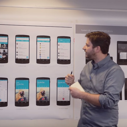
Google put up an informative 7-minute video on their Google Design channel that covers the foundations of material design, how it works, and how it can affect interfaces.
This is a great vid whether you’re familiar with material design or not. It covers the founding principles and how they apply to digital elements like buttons, links, or page panels. Material design was also made to handle user inputs like taps and swipes on touchscreens.
It seems that Google is really just getting started with this idea and hoping to drive it further along with support from others in the field. If you’re interested please check out their video and let us know your thoughts in the comments section below.
The post Material Design: A Behind-the-Scenes Look at How it’s Made appeared first on webdesignledger

