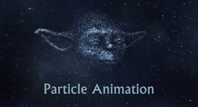
We have already examined websites that have dynamic, abstract home pages, today we are going to delve a bit deeper into this mainstream and take a closer look at particle animation that has become a quite popular instrument for adorning ‘welcome’ sections.
From simple dots that are chaotically scattered throughout the screen to dots that form various simple geometric shapes and complex images, particles animations vary. It can be a bulk of vibrant balls, a scope of flat circles, a mass of plane triangles or a ton of pieces of different shapes. What’s more, their behavior can hardly be called similar. The developers force particles to move around something, react to users’ actions or follow the mouse cursor, vibrate or dance. Some of them take the leading position while others stay in the shadows performing a supporting role. Nevertheless, all of them have one thing in common: they unobtrusively give the interface a sense of motion and a geometric vibe. Let’s take a look at some fresh examples.
Particle Animation in Web Design
Deutser
Deutser meets visitors with an ingenious welcome screen that embraces the power of minimalism. It includes a series of catchy titles that are bolstered by corresponding dynamic backgrounds. The latter steals the show with the particle animations that form various shapes and objects.
Share the Force
Share the Force matches the tone of the saga with its vigilantly designed cosmic theme. There are lots of interactive details, and of course, a particle animation that sets the backdrop to motion and greatly contributes to the general feeling.
Seven Brief Lessons
Here, the developer forms a circle from moving dots and forces them smoothly move around. Beautiful gradients strengthen the overall impression. The animation helps to focus users’ attention on the center and energize the homepage with dynamics.
Brandify
Brandify utilizes a complex geometric centerpiece where particle animation plays the first fiddle. It serves as a supporting visual device that enriches the front page and saves it from looking boring. It interacts with the mouse cursor to engage users and add playfulness.
NYCIG Marathon
Splendid, professionally crafted particle animation that is displayed in a perspective takes NYCIG Marathon’s landing page to the next level. It produces the overwhelming first impression, drawing users into the project.
Double Pi
Not only does Double Pi leverage particle animation to prettify the main background, but it also offers visitors some kind of playground. Tiny dots form a tunnel that follows the mouse cursor throughout the browser screen. Thanks to a tiny size and well-thought-out performance the effect does not distract attention from the important things.
Sift Agent
Sift Agent turns a cosmic theme to its advantage, giving the front page a marvelous appeal. Particle animation that is used to mimic star movement and create constellations fits here like a glove as well as makes its substantial contribution.
Sony Experia
Sony Experia’s homepage receives the playful mood from a ton of bubbles that move around the project and result in the title. They stay active all the time and explode when the mouse cursor hits their area. Each sphere is linked to a photo.
Signature Art
Signature Art establishes a sense of elegance, refinement, and sophistication. The front page is a playground that lets you create your signature from a bulk of microscopic 3D particles. You can zoom in to the final result and even carefully explore each detail of it. This trick grabs the whole attention and makes you stay.
Citak
Citak gets the most out of minimalistic design, opting in favor of a light, clean coloring, a ton of white space, streamlined navigation bar and scarce amount of content. The team leverages an eye-catching colorful particle animation that naturally concentrates the overall attention on the main tagline.
The Alkemistry
The Alkemistry has a small private particle animation that enhances one of the blocks. It goes well with a constellation-inspired backdrop and adds vibration.
Think Less Love More
Think Less Love More is a fully interactive website that balances animations with simplicity. A yummy candy placed in the heart of the screen is bursting with personality and charisma. It is masterfully created from tiny pieces that set the homepage into motion.
Decta
Decta has a particle animation that perfectly echoes with a casual atmosphere of the project. It either forms a globe with tiny connections or breaks into pieces that chaotically move around the title.
NodePlus
NodePlus has a strong character and creative vibe. Here, flat multi-colored triangles dynamically form the letter ‘N’, giving it a 3 dimensional sense. As a result, the page is overloaded with energy and action.
Petar Stojakovic
Petar Stojakovic separates his personal portfolio from the others. With just one small animation, the ‘welcome’ screen gets an eye-catching and visually appealing look as well as puts the titles into a dominant position.
VOID
VOID is a top-notch website that greets the online audience with a series of matchless abstract animations. The first one is a trendy and exquisite particle animation that instantly demonstrates a high level of developer skills.
CloudNine
CloudNine’s website design appears to be a variation on a SuperHero theme that is realized in the cosmic surroundings. The scene is partly brought to life with the help of a small and subtle particle animation. It makes the background shine and vibrate.
Treskon
Treskon features a video background with chaotic particles movement. It adds a subtle sense of motion to the homepage, gives enough prominence to the content and enriches the theme.
Fixed Group
Here delicate particle animation that is slightly noticeable plays a supporting role as well as finishes off the overall design. It reinforces the aesthetics, enhances background and gives the page a non-static look.
Orion9
Orion9 is an exclusive personal portfolio that at first sight may look a bit boring. The black-and-white color scheme, ‘Hello’ word and only several buttons to navigate – that is all that are included. However, after several seconds, a particle animation begins to fill the screen with dynamics and action, lightening the general atmosphere and encouraging users to continue through the website.
Conclusion
Particle animation sets a personal portfolio apart from others, helps to break the monotony of websites with a casual spirit, strengthens a theme and even benefits non-profit projects. It is a subtle yet powerful sub-trend that each day is gaining more strength.

