It seems that we have left huge drop-down menus behind, opting for little mobile-friendly hamburger buttons that skillfully hide a great panel with links, sticky streamlined navigation bars or just elegant slide-out sidebars; however, there are still projects that simply can’t function without large menus.
Classic and time-tested drop-downs that were once popular nowadays look massive, heavy and unstylish. Nevertheless, they still own a great potential, being able to easily dish up assorted information without sacrificing precious space. What they need is just some enhancements in terms of design and a slight upgrade to satisfy the needs of small and large screens.
We have found 20 fresh examples of improved extensive feature-rich navigation menus. They suggest that drop-downs are getting better: becoming faster, more lightweight and even richer with icons, and multimedia. Not only do they serve as a getaway for inner structure but also overwhelm online readers with ads, promo shots, social media and even a product box with a hot ‘buy’ button.
Large Drop-Down Menus
Adidas Football
The brand is famous for websites with huge and all-embracing drop-down menus that skillfully balance copy and images. Monochrome color palette, a considerable amount of white space and well-organized list create a pleasant experience.
![]()
Boutique Olympique Lyon
The website leverages accompanying icons that carefully visualize each menu item. They are used both at the top level and in drop-down sections. These nifty line style glyphs go well with the main theme and make the navigation more intuitive and visually appealing.
Treblecone
Treblecone utilizes blocks that take up only the required amount of space. In such a way the ‘welcome’ section performs its role of showing off motivational images even when a user browses through the navigation. Although the backdrop of the drop-down part is slightly transparent, it still provides optimal contrast to the content.
Le Slip Francais
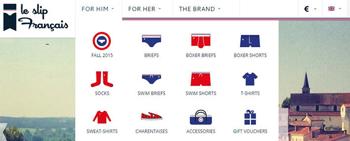
Le Slip Francais pays attention to the meanings of the menu item so that the drop-down panel relies on a series of relatively large icons. Just with one glance users are able to quickly find the desired category. Each glyph is made in a brand coloring and neat flat style.
Belazu
Belazu populates its mega drop-down menu with pictures. Since images are worth a thousand words, the solution livens up the project and navigation, making exploration more pleasant and handy.
Gibbston Valley
Gibbston Valley is another website that goes for a vast menu with supporting images that overlays almost the whole screen. Each picture cleverly represents a link, enriching the visual experience.
SM Seruya
SM Seruya has a highly informative and content-intensive website that needs to display lots of data in a convenient and straightforward manner. The enormous navigation panel starts with a traditional streamlined bar and ends with a huge slide-out box with links and promo images. It has a rigid structure and perfect organization that strengthens readability.
Acties
Acties has a relatively small drop-down menu that occupies only several rows. Each menu item has a supportive contour icon and is placed within a grid system. Grayish coloring nicely collaborates with the white backdrop and is consistent with the overall theme.
Reservoir
Reservoir has an elegant menu that complies with the website aesthetics. Although the font size is super small, titles are still readable because of a perfect contrast, list style organization, and ample space. The promo image strikes the eye right away, serving as a focal point.
Luxe
Luxe makes use of a menu that extends over the entire width of the screen. Despite of lots of unused space, the component is not overloaded with extra text or images. On the contrary, the team has retained an open feeling to add a generous amount of fresh air and reinforce the luxurious appearance.
Dogswelll
Here the team has managed to bring order to the primary navigation. Links are carefully laid out in several columns that are spaced at regular intervals and relatively large line height. As a result, each item has its place and the component has an excellent readability. Solid semi-realistic icons are the perfect complement.
MTV Serbia
MTV Serbia looks vibrant, dynamic and energizing. There are lots of interesting twists: asymmetrical layout, bright coloring, flat graphics, neon-like touches, videos and much more. However, when it comes to the menu section, the sublevels are made according to the traditional way of presenting data: solid color backdrop, simple arrangement, and perfect contrast.
THB Hotels
THB Hotels has a drop-down menu that fits here like a glove. Although it is content-heavy, thanks to accompanying icons and modular system users won’t get lost.
GSI Outdoors
GSI Outdoors tries to focus users’ attention on menu items without cluttering the design. The sub levels omit needless things and opt in favor of visual impact that is produced by images. The latter puts the content above everything and engages online visitors.
Royal Robbins
Royal Robbins has a semi-transparent sub-menu that looks refined. Although it partly overshadows the lush image backdrop, yet users still can enjoy its picturesque scene. White tones and sharp typography that are used for displaying titles help to delineate the content and make it easy to perceive.
Creative3 Design
Creative3 Design’s mega drop-down menu looks simply overpowering. It covers a lot of information that it is a bit annoying. Of course, the column-style structure tries to save the situation; however, it is hard to find the required link right away.
Nest Designs
Nest Designs employs blocks to show sublevels of the main menu. Each box comprises textual data and an image of a relevant product with an active link and CTA. This little marketing ploy increases conversion rates.
Clipper Round the World
Clipper Round the World has a classic drop-down menu that includes a properly arranged list of links. It matches the tone of the project and does not distract attention with lavish visuals. The small drawback lies in the coloring that needs some improvements since readability suffers a bit.
Secret Den
The top level of menu comprises only three links that are broken into a dozen of others and presented in sub levels. Although, as a rule, the drop-down part leverages only several columns, the team has left open space to make the navigation look more weighty and eye-catching.
Bracketron
As you can see from the screenshot, the drop-down box has a small flaw. Even though the menu meets the theme and has a certain level of elegance and sophistication, when it comes to readability it fails to perform its role properly. Maybe a less transparent backdrop would do the trick.
Conclusion
E-commerce, news websites, online magazines and those projects that have a complex information hierarchy prefer massive and feature-rich drop-down menus. They allow embracing all the categories and presenting them in a straightforward and intuitive manner, saving plenty of space. Accompanying images and icons give a fresh zest to the component.

