It seems to be that some colors, shapes and effects have a different appeal to both genders, and some can be equally as appealing to both. This can be a dilemma for designers when they design for gender-specific sites or universal sites.
Making your site or project appeal to your target audience in terms of gender is not easy – there is a fine line between the variations, so here we have rounded up some examples of website design that appeals to men, some that appeal to women, and some that will appeal to both genders. This is possibly a matter of a opinion, and is written from a female perspective.
1. Website Designs Appealing to Men
These sites have, in general, strong, dark colors, sharp edges, bold shapes and often include the automotive industry, industrial trades, certain sports and technology.
Acme World
This monochrome site is very masculine, with a large, empty industrial unit as their landing page image. As the company is concerned with industrial solutions, it is no surprise that the site has a masculine feel.
Currys Tech Talk: The Future is Now
This infographic site produced by the UK electrical outlet Currys, is concerned with the predictions from the film series Back to the Future. They have looked at the things encountered in the future travel, and how close or not we are to actually having those things now. Presented in a turquoise/blue color scheme, this is more appealing to men than women.
Maxime Rimbert
This is the portfolio site of Maxime Rimbert, a French interactive designer. Using some monochome urban images, with some works featured on a slide show on the landing page (the slide show moves along by dragging the mouse – or, no doubt, swiping on a mobile device). The site definitely has masculine appeal.
Vredestein – Rock the Road
This tire manufacturer uses a video on their landing page, featuring a fast car, manly men, beautiful women…. imagery that is aimed towards appealing to men, and although things are changing, the automotive world is, at the time of writing, still male dominated.
Group Atalante
This company offers yacht management, crew management and administration… all for yacht owners. A most beautiful image of a yacht with a reflection of the sea and sky is very appealing to both men and women, but I would think the majority of yacht owners are men, and I would also imagine that men would find this landing page very appealing.
JOT Automation
This company tests wireless devices. Their site is presented in a predominantly blue color scheme, giving a no-nonsense feel to the site.
J. Walter Thompson
Here is another site with a predominantly blue color scheme – but the masculine selling point here is the intergalactic image!
2. Sites with Feminine Appeal
Females in general are attracted to pastel or light color schemes, soft lines, irregular shapes and the particular niches include fashion, children, family, interior design and food/restaurants.
Frenchmill Studios
Without it being too much of a cliche… this site will appeal to women simply through the pastel to dark pink color scheme, which is traditionally associated with girls/women. The light bulb with wings is also a soft, gentle touch… all in all, visually this site will appeal to women.
N.Lee Design Bureau
This site’s landing page has a kind of ‘peep hole’ that we are looking into, which gives the impression of sneaking a peek at the working lives of the featured people included in the video. The soft gray colors of the background, along with the pastel colors of the logo and the female dominated video make this site very appealing to women.
Soho Restaurant
The image shown below is like an interior design image, although it is inside the restaurant. This type of image will appeal to women and make them want to visit the restaurant.
Fasett
This site’s landing page has a video that is completely about families – with children, father, mother, all playing with huge bubbles. Traditionally this imagery would be aiming to appeal to women in particular.
Cafe Frida
There is no explanation really needed for this landing page – simply a floral background with the cafe’s name in the center.
My Very Own Mykita
This is the landing page for an eyewear manufacturer. I wasn’t sure initially whether this would fall into the feminine or neutral category, but the softness of both the color scheme and the moving waves in the center circle tipped it slightly to feminine appeal. Running the mouse over the center circle creates deeper, darker and faster moving waves.
Kindergarten Firebird
This Russian site uses beautifully aged images of children – both the vintage coloring and the children will appeal to women.
3. Sites with Neutral Appeal
Sites that appeal to both genders often have a mix of both of the descriptions for male and female preferred designs. Colors are often not pink or blue, but orange, green or yellow for instance. The subjects of the sites are very varied, but can include historical sites, real estate, holiday resorts, drink and fragrances.
Il Cambiamento Siamo Noi
This Italian site opens with a very aged image of a horse and cart. The historical aspects of this site will appeal to both men and women.
Tillamook
This site uses a very dark image of berries on the landing page. Nature is equally as appealing to both men and women.
Daniel Kuhnlein
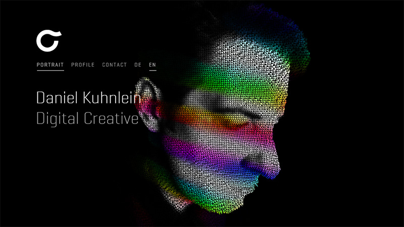
The landing page of this portfolio site at first glance may seem quite masculine, but the amazing animation effects of color and shape on the 3D head (presumably that of Daniel Kuhnlein) will be appealing to both genders.
Leandro Lima
A very clever design to appeal to both men and women, using a color scheme of blue and pink.
EGGFOO
When designing a site that you want to appeal to both genders, you have to think of a cross-gender color scheme… and orange is one solution, that this site uses with beautiful effect.
Sweet Punk
Just in case you didn’t believe me with the above example, here is another example of orange used in web design that has appeal to both genders.
What is Burning Man?
This site uses soft but quite dark pastels, with a diamond shaped grid layout as you scroll down the page – just generally very appealing visually.
Conclusion
For general site design, the designers are attempting to appeal to many ages and both genders, but very often the appeal will tilt one way or the other. In this modern age, it is becoming less of an issue as we can all appreciate what would have at one time had strictly male or female appeal. It could possibly be perceived that this round-up is a little controversial as it is no longer politically correct to differentiate between traditional ‘pink for a girl, blue for a boy’, but the fact is that as men and women, in many, many cases, we do have different preferences.
The post Sex Appeal: Site Designs with Masculine, Feminine and Neutral Appeal appeared first on onextrapixel

