Take a look at these brilliant designs that use negative space and be inspired! You’ll be amazed by how smart these are!
Here you’ll find multiple types of designs that use negative space in a clever way, from posters, business cards and other prints, to packaging designs, logos and ads!
These beautiful designs will surely inspire you to create awesome projects as well.
Here they are! Which ones do you like most and why? Let us know in the comment section below.
Frame an image

Combine elements

Use shapes
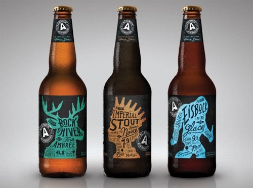
Bring in the culture
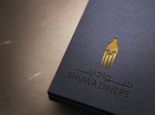
Use layers

Have a character

Push limits
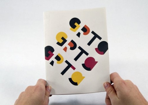
Flip it upside down
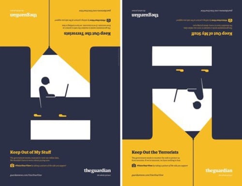
Use it minimally

Display your message

Use letterforms

Bring in other elements

Don’t overdo it

Choose sides

Don’t use a solid label
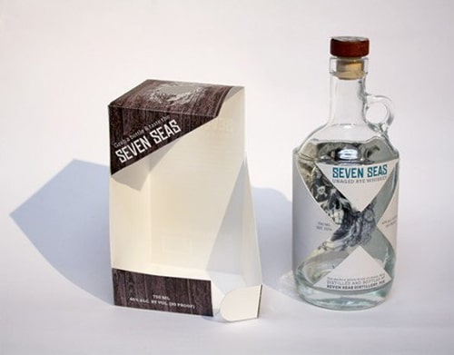
Create contrast

Use your product

Play with people’s minds

Let it breathe

Shift the focus
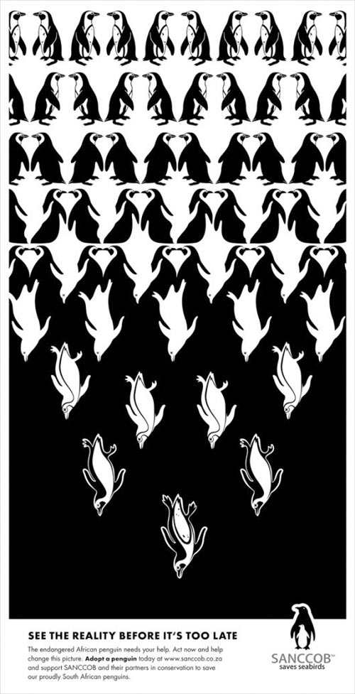
Actually use negative space
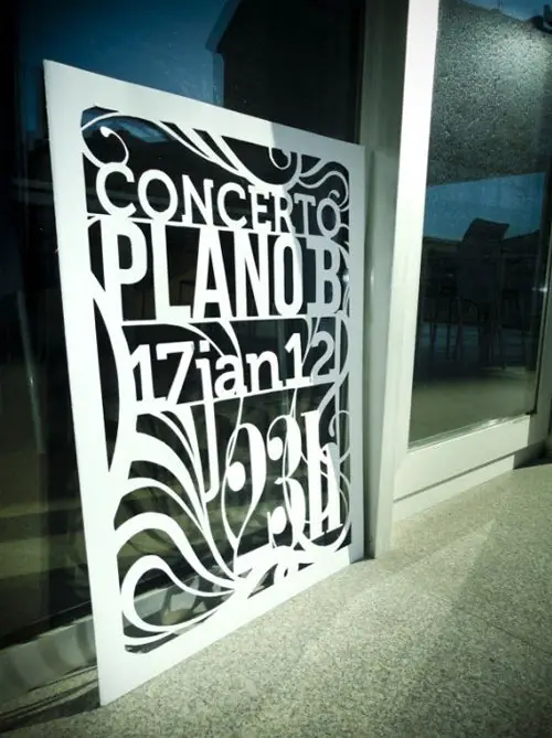
Make it work

Be illustrative
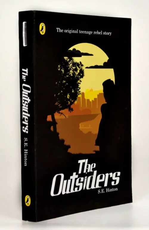
The post Showcase of Brilliant Designs That Use Negative Space appeared first on Line25.
