In the struggle for sophisticated aesthetics, it can be challenging to strike a balance and preserve harmony. Websites that try to achieve an artistic vibe by fitting all the possible solutions into one project such as dense textures, doodles, lavish illustrations or rich multimedia may end up in overpowering design and weak structure. To avoid such an unfortunate outcome, you need to stick to a clean and reliable layout and go for several ornate touches that achieve the desired level of artistic vibe.
With just a little sprucing up, any UI can be taken to the next level. For example, food-related websites that for a long time relied on yummy images, nowadays magnetize with an intricate and original appearance built by carefully treated textures, badge-style logotypes, and beautiful typography.
There are numerous projects dedicated to spheres that are far away from being called creative employing a limited amount of decorative details. Today we are going to explore website designs with fine touches. Some of them look illustrative yet modest while others almost scream out at you with their strong yet harmonious appearance.
Hofbutjer
Hofbutjer’s website looks outstanding. It bolsters brand identity as well as kindles the appetite. Wood textures and bold retro style typography go well with natural scenes and professional photo shots of the product.
J.W. Doescher
J.W. Doescher’s UI establishes a cozy atmosphere that gently invites visitors to dive into the project. Gorgeous badge-style logotype that takes up the central position skillfully splits the navigation bar into two parts, complements the background and adds a nice ornamental feeling to the project.
Voodoo Priest
Voodoo Priest’s website design gets an appropriate feel from dark coloring, mysterious images, a handful of vigilantly crafted sketches and several decorative elements. All the components play nicely together, providing a memorable user experience.
Outback
The team does an excellent job of utilizing textures together with sweet photos to give Outback a matchless appearance with a tasty flavor. Wooden textures nicely interact with chalkboard textures, creating quite a harmonious decorative aesthetics. Complementary details such as a vector stamp reinforce the effect.
Muerto Gram
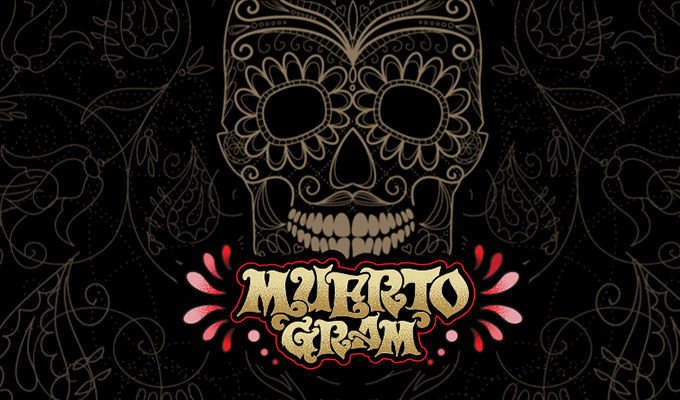
Muerto Gram breaks the mold of conventional website design with a carefully crafted florid illustration of a skull. It looks original and interesting. This small amusing service is driven by the spirits of Dia de los Muertos (All Souls Day).
Domino’s Pizza Legends
The website plays heavily on chalkboard style elements. Typography and graphics that are used on the front page meet this direction. Along with brand coloring, they personify the identity. The logotype with a distinctive 3d note also contributes to the general feeling.
Wewalka
Wewalka keeps things simple and tidy. The aesthetics are enriched with some beautiful ornate touches, such as professionally treated cardboard texture used for navigation, fancy stamps, hand-drawn icons and elegant calligraphic typeface.
Lipton
Lipton is bursting with energy and positive mood. The friendly atmosphere prevails on the project. Beautiful doodles that are scattered throughout the page in tandem with a cheerful, vibrant color scheme and positive images achieve an outstanding result.
Volontaires Euro 2016
Much like the previous example, the website of Volontaires Euro 2016 is marked by a splash of bright colors and fancy doodles with sports motifs. They charge the project with energy and give it a good aura. What’s more, the background is also worth attention: it is beautified with a delicate and flourish pattern.
Scenery Resort
Scenery Resort gives off naturalness and purity. The website owes its elegant aesthetics to good utilization of textures and realistic renderings. As a result, the project looks sophisticated and professional. It balances lots of elements, successfully preserving the harmony.
Maria and Ricardo’s
The website is marked by beautiful touches that, paired with coloring and delicious images, create friendly and attractive aesthetics. Everything is well-thought-out: delicate script typography matches the tone, textures are seamlessly integrated into the design and fancy patterns, stamps, and some tiny decorative details finish off the theme.
Mrs. Onion
Mrs. Onion gets its dominant decorative feeling from the typography that is advertised. Much like the typeface that looks bold, loud and creative, the website has a fancy appearance that seizes the attention right away.
Print is Dead
The website has a clean design with some spice. One of the sections features a beautifully illustrated skull that provides the UI with a subtle decorative appeal. Together with a gorgeous logotype, it creates a buzz.
Lunati Scenografie
Lunati Scenografie leverages doodles in a creative way. Although the project features lots of sketches that accompany images and rendering, they do not overwhelm online visitors. They smoothly coexist giving the website a particular charm and a splash of personality.
Ms. Michelle’s
Ms. Michelle’s is another flawless website dedicated to the food industry. The vibrant color scheme, appetizing images, and decorative elements are characteristic traits of the design. They separate it from the others and magnetize with an organic feel.
True North Restaurant
The website of True North Restaurant has an attention-grabbing logotype that is placed on the center stage. Not only does it enhance the design regarding brand identity, but it also enriches the aesthetics adding a beautiful decorative note to the front page.
The Lucky Bee
The Lucky Bee looks juicy and eye-popping. The homepage does not have a classic feel, although it is based on a standard modular layout. It has a jovial character and charisma that are achieved through the fancy background, gorgeous and somewhat quirky typography and a riot of colors.
Cafe Frida
The beautiful flower-inspired pattern that is used for the background is the primary visual force that catches the attention and provides the UI with an ornamental vibe. Although it may seem a bit outdated at first, it works well in this context.
Aroozoo
Much like the previous example Aroozoo is based on an amazing nature-related background that gives a fresh feel to the aesthetics and contrasts with the otherwise clean, neat and crisp design. The website has an element of playfulness and an eye-pleasing nature.
Block16
Block16 speaks completely through savory images and sophisticated design. Chalkboard-related elements and a bold typography fit together, equipping the UI with a marvelous, elegant appeal.
Conclusion
If you do not know how to handle sophisticated designs with a creative nature, then opting for several yet distinctive decorative details such as textures, patterns or a fancy typeface can save the day. These ornate touches can add a subtle artistic vibe, and in some cases, even considerably enrich user experience.
The post Stunningly Web Designs with Ornate Touches appeared first on onextrapixel

