Are you doing everything right and still striving to get results? Are users still abandoning your landing page? Do you think that you are not getting enough results from the money which you are spending on your pay per click campaigns?
In this post we will discuss some of the most useful tips to optimize your landing pages.
Improve Congruency
As the word Congruence means to function in collaborative manner, this implies that the complete experience must suffice to a single motto for your customer’s expectation.
This is where you need to show your proficiency so as to match the complete experience of the website must match to the expectations of the customers. While optimizing a landing page do keep in mind that you need make your landing page congruent. You need to ensure that the services which you offer on your landing page suits what visitors are expected to look at.
Many people serve their home page as their landing page, but they fail to realize that this is a mistake.
This is because the home page of your website a holistic description of your firm, wherein your landing pages focus primarily on individual service which aptly fits to the advertisement or from the source from where the users are coming.
This is why the you must have different landing pages on your website which are then advertised by a suitable keywords which is in congruence to what you are trying to convey from your landing pages.
Moving further you can also divide the traffic of your website into demographics or groups such as male, female, college students or young professionals which can be directed to a separate landing page.
This will further help you to find out the ones who are exactly searching for your website and looking for your post. Moreover, the more knowledge you will have about the market of each page, the more effective and congruent landing pages you will design.
Let the clients speak of your mettle
Who wouldn’t like to gain the benefits of a product who has helped some else?
This is why the most important thing to add in your landing pages are social proofs. You can add reviews, success stories, testimonials, and case studies.
Find as much as social proofs you can have for your landing pages from the targeted market which comprises of a success saga.
Increase your Click-through Rate: Use CTA
It has been studied that the overall Click-through Rate increases if you use a Call-to-Action Button.
Gone are the days when we used to use just “submit” for your call to action. Now is the time to remove all the stereotypical statements or trends existing.
Your call to action button is of great importance. There is certainly a difference between a conversion and a bounce, but there are many people who actually do not pay heed to them. Having a good landing page does not matter until you do not have a good CTA.
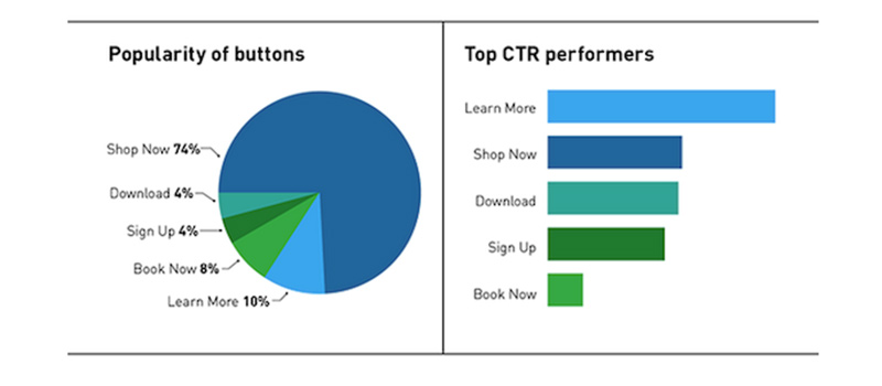
Some of the top performing CTAs which offer top CTR are shown in the picture given below:

Congruency among the CTA and Headline of the page
Now that we have talked about CTA and its importance, we need to make sure that your complete web page narrates a story.
For this you need to make sure that the headline of your page aptly matches to your CTA. If you fail to provide what you are promising on your landing page and when the user will come to know that the words on the landing page are just a gimmick, you will tend to lose your audience.
The confusion aggravates more if the page heading does not match that with CTA. This addles the users as they keep on wondering what to do. If you need to convert your potential customers into clients, you better got to remove all the confusion. You need to ensure that your landing page provides what it has promised.
Test the Copy
One of the very simple formula of success if benefit. Let me explain this with an example.
Suppose we have two vendors who are selling my favorite fruit orange. They both are selling the same quality of fruit, but vendor A sells the oranges for a dollar less which will attract the customers because they find this scheme beneficial. This was a very simple example of benefit, but this does not imply that you need to lower down your price so as to attract customer.
I am here trying to prove a point that you need to add something extra which must be beneficial for the customers.
Do not run with the precept that “God is in the detail”. Be crisp and clear while conveying your message and tell the clients that you can solve all your problems within no time.
There is no single remedy for designing perfect copy for your landing page. You need to test and try your method so as to get the best result from your landing page.
You can also try videos or plain text as well. In a lot of cases we can see that the short copy is good for a low-risk or free offer, on the other a long copy is good for selling a paid product. However, in the end there are no strict rules for this as everything depends upon your choice.
All you need to do is choose the most suitable copy for your website which leads to success.
Minimize Distractions
In this busy schedule no one likes to read in detail, they just look through the pages.
If you do not provide the right details on your landing pages and instead stuff it with distractions, you will certainly tend to loose. You need to remove all unnecessary, confusing and space hogging things from your design.
Craft a neat navigation flow to take all your clients easily through the conversion process. Make sure that the site provides clear instructions by incorporating all the requisite forms or buttons and proper directions as well.
Contact form optimization is must
Another important page optimization technique in which one needs to adopt is to make the contact form appear shorter so that the clients do not hesitate to fill the monolithic and monotonous form.
On the very first page try to minimize the details required. However if you really can’t do so then you need to apparently make your form appear smaller by proper placement and styling.
In order to achieve this you can reduce the spacing among the two fields, this will tend to cut short the space covered by the form and its elements will appear less scattered.
You can also implement Smart Fields. These are dynamic fields which that have the capability to acclimatize to the short version if in case a user has already registered in your database.
I hope these tips will help you to optimize your landing pages. Feel free to share your queries in the comments below.
The post Tips for Optimizing Stereotypical Landing Page Designs appeared first on webdesignledger

