As we mentioned in our previous article that was dedicated to dynamic abstract front pages, static images are still the most popular choice when it comes to backdrops. With numerous photo stocks that are available at the fingertips, and a bunch of images on the wild that are available under CC license, it is the most painless and quick way to provide your project with a proper visual foundation. It helps to convey the message, strengthens the idea of a project and improves the general atmosphere.
Today we are going to pay particular attention to those photo shots that depict night landscapes and cityscapes. They are quite rare in website design, but it does not mean that they are less impressive or effective in what they can do. They are just different. They hide a powerful energy of the nighttime that should be channeled in the right direction.
Of course, the details of the composition are slightly blurred and obscure in comparison to photos taken in the daytime, yet this is a benefit rather than a disadvantage. This tiny distinction provides foreground elements with an ideal contrast. Staying in the shadows, they manage to enrich aesthetics with intense and deep colors, add naturalness/urbanity, express some motion and envelop users with a mysterious veil. So that let’s delve a bit deeper into them.
Gille Interim Management
Gille Interim Management has a beautiful urban vibe. Night cityscape photo background with lots of light and impressive skyscrapers energizing the general atmosphere and exudes an image of authority.
Secret Wood
Secret Wood’s homepage looks mysterious and secretive. Foggy landscape in grayscale mode goes well with a solid logotype spiced up with grunge touches as well as strongly supports foreground content.
Pixel Bytes
Pixel Bytes gets its beauty from the gorgeous night sky that is overfilled with stars. A subtle gradient gently highlights the slogan and delicate ghost buttons and gives the overall aesthetic a cutting-edge feel.
Eksakte
Eksakte leverages a slightly blurred photo of a night cityscape that conveys dynamics. It adds to the modern appearance and makes the tagline more prominent and important.
North Point
North Point uses the most beautiful sunset backdrop with a silhouetted figure in the foreground. They use the tagline ‘We are a digital product studio that craft services and experiences that make people happy.’ And their landing page image certainly does just that.
Alexis Bertin
The portfolio of Alexis Bertin is based on a simple dark image that makes the background an ideal platform for displaying tagline and other important information. Grunge typography with a personal touch and yellow tone used for accent also perfectly collaborate with it.
Dreamweaver
Dreamweaver has borrowed a powerful and authoritative atmosphere from the spectacular cityscape image backdrop that at night time radiates dynamics and special charm. The rest of the design placed on it looks very smooth and pleasing.
The Edge Dubai
The Edge Dubai is a first-rate project that offers a unique experience. At first the website welcomes visitors with a day image that several seconds later smoothly turns into a night version. The trick sets the tone. The canvas perfectly collaborates with light and delicate icons.
Bilbao
Bilbao offers users to embark on an adventure through the night city. An interactive walk is realized on the basis of a series of professional high-quality panoramic photos that open the town from another angle.
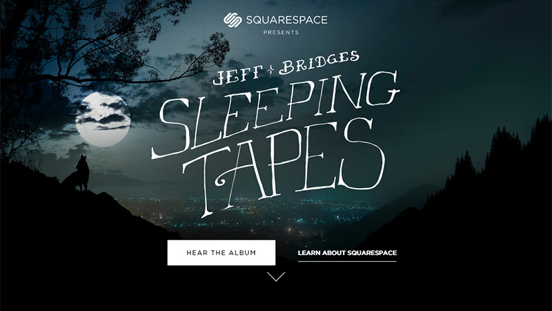
Sleeping Tapes
Sleeping Tapes demonstrates how to incorporate character and quickly clarifies the idea of the project by using a proper background. It meets the theme and reflects the mood. Quirky typography with a human touch and flat solid CTA reinforce the effect.
Scotch Digital
Scotch Digital has a high-tech vibe. Beautiful photo of a dark sky makes for a great background and ideally fits with the techno style typography. Generous amount of white space lets the website breathe with a fresh chilly air.
GFI Capital Resources Group
GFI is overfilled with the urban feeling that is skillfully recreated by the brilliant cityscape. Although there are lots of lights and details, the solid sidebar on the right and the main tagline seize the attention without problems.
It’s Digital
It’s Digital has a series of fantastic and appealing images made at night time. They are enriched with colors, gradients and blurred effects, giving the user experience a nice twist.
Baia dos Anjos
The UI leverages several photos of the city that in the main, owe their beauty to beautiful evening time. They convey how busy the place is and add energy of a stirring life to the project.
Armstrong International
The aesthetics of Armstrong International’s front page is centered around the splendid photo of a night city shown in grey scale mode. The absence of bright colors naturally focuses users’ attention on the information and aids navigation as well as adds a subtle sense of urbanity.
Mevato
Mevato skillfully mixes primary coloring and the background. Blue and white set the calm and serene atmosphere while the dark image, full of red and violet tones, strengthens the effect.
BBAC
BBAC gets a sophisticated and elegant atmosphere from the properly selected image backdrop, line style elements, neat formatting and sharp typography. The content utilizes the contrast provided by the dark canvas to become the focal point.
Expo Cometes
Cosmic theme is nothing without a sumptuous and grandiose image background that exhibits outer space. Since all such pictures feature darkness, this one is also no exception. It matches perfectly with all the integral elements including graphics and typography.
The Burnsteads
The Burnsteads leverages several images for the welcome section in order to make a good impression. However, a photo of the house at evening time is the most impressive. It evokes positive emotions and illustrates the phrase ‘Home Sweet Home’.
BCTION
BCTION is filled with action and dynamics. The general atmosphere is recreated on the basis of the nighttime photo background that is energized with mystery and motion.
Conclusion
As a rule, designers prefer to utilize images that are taken in the daytime, since they are lighter, brighter, more rich in color and clearly convey the message. However, night landscapes and cityscapes have their own incomparable beauty and spirit. They fit with various themes and equip projects with matchless appeal. In the right hands they also look detailed and help to formulate the concept more effectively.
The post The Powerful Energy of Websites with Night Landscapes appeared first on onextrapixel

